Thanx john for the Critique: I agree with all you wrote.
Acctually, I had no choice about the light: in the whole week of the challenge we had fog and only on sauturday there was sun forecasted.
But on that day I had to work and only got a 15 minutes break on which I rushed to the building which was then just out of it's own shadow.
My intention was to make a strange looking submission to the challenge. The comments showed me that it worked.
Therefore I have choosen the sepia toning to make the picture look even more strange.
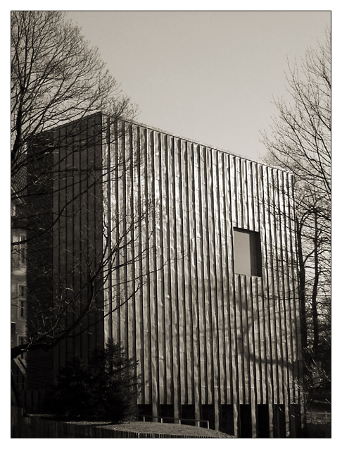
This is an interesting 'square' concept. The window on the building is standing out nicely. I also like the contrast created by the shadows from the sunlight in this shot. The exposure on this shot seems a little strange. I'm not sure how easy this particular photo was to expose properly. It looks like there is quite a bit of direct sunlight to deal with here, but the darker areas are still nicely exposed.
I think that one of the strange concepts here is the sepia toning maybe. In my opinion, sepia toning is used primarily to create a sense of age or antiquity in a photograph. The process is used to try to duplicate naturally faded old photographs. this building has a more modern appearance and that somewhat conflicts with the sepia toning in the image.
Thanks for all the comments, especially the "what is it?"-comments.
Here's what it is:
It's the newly build archive of the "upper-mining-authorities" of northern Germany, located in Clausthal (Oberbergamt).
So it's a building containing all the files and books about mining dating back for maybe 400 to 500 years up to now.
Such a building does not need any windows, only at ground level there are some.
The architecture is extremely modern (the other side is even more interesting), because it sets a strong contrast to the main building that is more then 100 years old.
The window you see is actually some artistic addition to the building: on both side of the wall there is such a window and in the middle of the room there is nothing more then a table with a pile of books. Unfortunately I could not capture that well enough from below.
A catchy title for a good image. Masterful rendition of tonal range. Detail in the shadows where it counts. Lively highlights without the glare. Lovely gentle grays in the sky. I really like the trunk squiggle beneath the big square. It breaks up the vertical lines very nicely. Superior talent in the B&W dept is evident.
The crop is a little too tight for my taste. I also think it needs a little more contrast. Not a bad photo and I do think that monochrome is well suited for this pic - Inspzil
Composition: Good. Brightness of the right face contrasts well with the darkness of the left.
Technical: Good choice of colour and contrast. Nice border.
Meets challenge: Yes
Overall impression: Technically good and nice pic. 8
Nice shot. Good focus with nice cropping. I like the sepia tone here. But what in the world is this and where is it. I hope you tell us. It sure fits the challenge.
I like the color and the background setting of the photo. I do feel that it needs something more. It seems a little plain. The black and white adds a nice touch. Nice job.





 Add photograph to your favorites
 Add photographer to your favorites


 Photographer found comment helpful.


