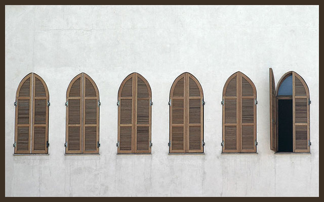
excellent shot. the only thing i would have done differently (assuming you had the space to work with) is put more space under the window than over. i learned in art school the eye is more pleased by space under an image than over it, due to natural distortion. ok, so I'm going a little out of control with this one.. great work. should've placed even higher IMO.
returning for comments:
A very nice study as is. I am tempted to suggest that this be photographed closer to the wall so as to create a perpective take. However, that is another picture. Bumping up on composition.
Slight coutner-closkwise tilt, but I like the image overall. I'd like to see this in a sepia or duotone to emphasize the shapes more than their individual tones. Nice work!
Good lines, nice colours, exposure etc. I'm not sure straight on is the best angle, did you explore other angles? Almost straight on makes it difficult to do anything else with the image creatively I mean. How about from one side and experiment with DOF? A six anyway from me.
Great idea! However, this needs to be pushed to the next level. Consider reshooting and doing some of the following:
- place the open shutter at a steeper angle so we can see more of it.
- Consider shooting when the natural light is more dynamic and interesting.
- Make sure your perspective is TRULY flat. There are tiny signs of perspective shifting that hurt the photo's ultra-symmetrical composition.
- Use photoshop to increase the sharpness. Boost the saturation of certain hues (such as the brown shutters) and exaggerate the contrast. Bring out some minor hue in the wall so it isn't so boring. Burn in the residual dirt along the bottom of each window.






 Add photograph to your favorites
 Add photographer to your favorites

 Photographer found comment helpful.


