*Hello from Sid and the Critique Club*
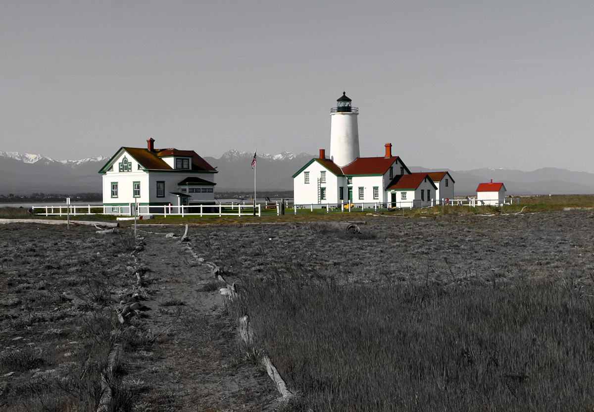
Your image has immediate impact with the buildings standing out from the rest of the desat image. In respect of the challenge it conforms with the desat elements.
I strongly agree with your commenter, your composition could have been greatly improved by moving the centre of interest on the upper third and reducing the amount of bland boring sky to just above the top of the lighthouse in preference for more of the foreground.
I also think you lost an opportunity to make more of the desat part by making much better use of the mono tones to given it even more impact through the use of a fuller tonal range and contrasts. A couple of other minor points, I think the yellows ought to have been subdued and timing wise it would be great to see the full coloured flag blowing in the wind.
I think your image works because the coloured areas include so much white they could still be part of the desat elements. I think desat works best when the coloured areas are kept to a minimum and although there is fair amount of the image retaining the original colour that is the effect we have here because the dominant colours are fairly minimal and they're broken up.
Happy shooting Sid |






 Add photograph to your favorites
 Add photographer to your favorites


 Photographer found comment helpful.