Greetings from the Critique Club.
This is a very creative approach to the challenge.
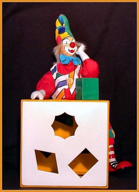
I think if you could have made this one a little sharper it would be better. I also think that photo itself is rather flat. Try adding a back light to seperate the subject from the back ground. The colors in the photo are very nice. I know this isn't much to go on but if you had added a backlight and had sharper photo this one would have done better in my opinion.
Wow. finally a shot with a figurine that I like. Very nice interpretation of the challenge, and cute title. The only thing I'd change, I'm being anal retentive but it really stands out, you should try to make the bottom line parallel to the horizon. Jacko. 8
Great composition and well executed. The border adds to this photo. If it weren't for the right hand sitting on the box it would look like a real person. Great job. Lovely colors. It's a 9 for sure.
I like the contents of this photo. Although I believe that this particular photo would have done better in a catagory of shapes. The lighting is a little too dim. All in all its a good picture.
I really like the colors and composisition here. It would really benefit by using more of the alloted 150kb file size though. That would sharpen it a lot. Probably could use a dose of Neat Image as well. It's really nice but could have been something really special IMHO.





 Add photograph to your favorites
 Add photographer to your favorites

 Photographer found comment helpful.


