What I like:
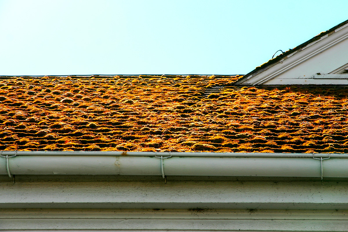
- The sheer number of lines and angles makes for an interesting shot
- I like the gradient from bright sky to dingy soffit
- It is an interesting take on the subject.
- I generally just like dystopic/ desolate pictures.
What I don't like:
- The colors. Yes the orange contrasts highly with blue, and that can make for a an eye catching photo or an unsettling mood- which would go well with the overall feel of this shot. But I feel like in this photo, the contrast between the blue and orange is too much and strains the eyes. Making it hard to look for a long time.
- It grainy.
Overall: Great idea, fair execution |






 Add photograph to your favorites
 Add photographer to your favorites


 Photographer found comment helpful.