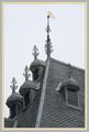
I put a curl effect filter on the image and tried to place it into the tree branches without altering the rest of the image. Then a simple wash out border filter for the edges. I had a little trouble selecting a crop on this one. The upper right sky is too white, but i would have liked to shown the top of the chimney.
Statistics
Place: 42 out of 86 Avg (all users): 5.8681 Avg (commenters): 5.8571 Avg (participants): 5.7302 Avg (non-participants): 6.1786 Views since voting: 1152 Votes: 91 Comments: 24 Favorites: 0
I think this image was good, but you actually took away from it with the photoshop work. The foreground is a bit busy but I like the old wagon/cart thing leaning against the wall. The foreground flowers I could care less about. They don't add much to the image.
The white uneven photo does not help the photo, I think you should have made it a solid white black border or something dark single colored so that the white house and the sky stand out.
I think this would work really well with B&W or Sepia tone perhaps some dust and some other photoshop work to make it look "old" and it would be much better.
It definitely meets the challenge, composition is good (aside from the forground flowers), focus is great and exposure is dead on. Good try but could be a bit better.
very nice shot. The subject and framing are great. I don't like the border effect, and I really don't like the swirls effect. 8 w/o the post-processing. 6
Wow, gorgeous. I love the pattern of the dead vine on the wall. Your border is really cool, such a shame that we can't get away with those types of effects every week!
Oh, I just realised that the spirals are a filter! Very subtle. I didn't realise until i noticed it was on the flowers too.
Very whimsical. Looks like a jogsaw puzzle. I think that this photo would have stood alone well without all of the effects added. Good luck in the challenge.
challenge met. what a great picture of the house with all the vine growing on it, the hayball hanging up, and the colorful flowers in the foreground. i can see that you made plenty of use of the relaxed rules this week. :) i kind of like the edges that look like the whole photo has been painted in broad brushstrokes onto the page. to be honest, though, i don't quite understand why you added all those little "twists" to the photo. for me, they don't add anything and actually take away from a pretty photo. but ... that's just personal opinion, and i'm sure you get comments for and against this :)
Jolly strange residential cottage. I see a hay barn with the hayloft door for loading hay bales in and out - having done a good bit of that in my youth. Still, a nice photograph with flowers and sharp focus. High marks. JEM
Very cool shot!
Comment editted - My BAD. I did not enter this challenge and did not see the extra rules for it. Sorry. Awesome shot! Love the curly things. 10 Swash
(please for give a dumb old man!)
Has kind of a storybook feel to it. I like the old building and cart. The greenery and flowers add to that feel, but at the same time they don't look like they belong there. I'm "iffy" about the "lost edges" treatment, and I really don't care for the whole "curly-q" thing that's going on.
What kind of frame is this? Not one that is enhancing the pic at all. White frames with washed out skies are a bad idea. Kind of eliminates the doubt the whether or not the sky is washed out. - Inspzil
Nice, colorful pic, and the first use of the new lax border rules that I've seen. Looks like it could be a little more irregular on the right side for consistancy with the other three sides.
I really like this picture but the white border really emphasizes the blown out sky on the right. I'm really not sure why you went with a border like this, It's a beautiful, vibrant pic, and for me it takes away from the picture.







 Add photograph to your favorites
 Add photographer to your favorites


 Photographer found comment helpful.


