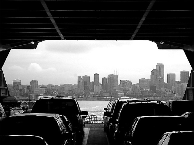
Once again, I really like this photo. I agree with one comment about the sky. If in photoshop you could get a bit more contrast in it I think it could help the picture immensely.
I can see the definition is there in the sky waiting to get out but I understand that for this site its hard to get all the elements to balance out becasue of being limited to no layers to seperate the various levels. Still great photo :-)
This is one of my favorites. It causes the viewer to take a second look. The dark in the foreground really contrasts nicely with the grey of the cityscape, and I like the way the ferry opening forms a "natural" frame for the picture.
while you can't do much about it for this contest without cheating, I think you might up the quality of this pic a bit by adding a little more contrast to the skyline itself so it's not quite so flat
I like this shot a lot. Nicely centered... although I wish the cars could be more symetrical. The image is very busy, which isn't such a bad thing in this case. Your meaning is clearly shown.
Difficult framing pulled off nicely. How did this look in color? I'm not sure b&w is the best for this, but I do like the darkness in the cars, putting more emphasis on the horizon and what awaits the travellers
transition from one side to the other - also like the dark to light 'portal' view. Good use of black & white, nice leading 'lines' of the cars. Well framed - good shot. Only problem is, the subject matter isn't too arresting/ interesting to me.






 Add photograph to your favorites
 Add photographer to your favorites


