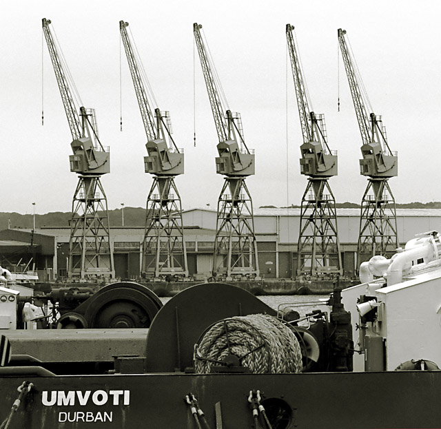
I love the symmetry and the obvious implied lines. I like the tones used and I like the simplicity of the shot. Or should I say the almost simplicity because what I don't like is the boat / ship in the foreground cluttering things up and partly obscuring the dock wall and cranes on the other side. Also having the skyline almost exactly across the midpoint of the shot is not a good idea. It also cuts the cranes in half. I'm not sure if any of these things was within your control, (I wasn't there), but if they were that's how, in my opinion, the shot could have been improved. Its still worth a six though, well done.
Too bad about the text on the boat/barge. It really pulls the eye away from the symetry of the crane booms. Should have either cropped or cloned it out. Lovely tones in your photo.
I think this would have been a lot better if you had cropped out the bottom of this photo and left only the tops of the highest roof the hills and the cranes. Heck they might of even asked for you to validate it assuming you cloned the cranes to get them so perfectly lined up...







 Add photograph to your favorites
 Add photographer to your favorites


 Photographer found comment helpful.


