Holy crap! This is sooooo much better than 2% percentile. Keep shooting, Payam, because this photo is good. Much better than these fickle photos can imagine.
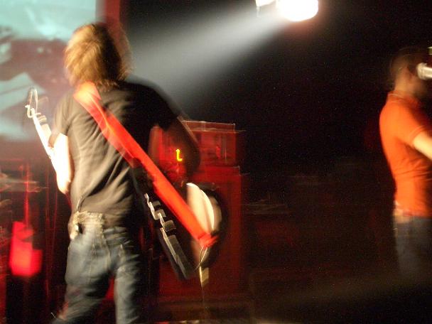
I'm honestly shocked this photo did so poorly...I realize it doesn't shout 'poverty' like alot the shots..but the idea of the starving-artist isn't new or complex. I thought it would've been obvious.
while i get your idea, and understand the plight of a new band, this image would probably have been more effective in the music challenge than in representing what poverty means to you (at least in terms of what you want to convey to the viewing audience...). as far as the image goes, it does have a certain vitality to it, but i would either include all of the orange dude, or crop him out completely. also, the red object to the left is a distraction. keep in mind, this is a challenge site, and images where all the elements tie together will score higher.






 Add photograph to your favorites
 Add photographer to your favorites

 Photographer found comment helpful.


