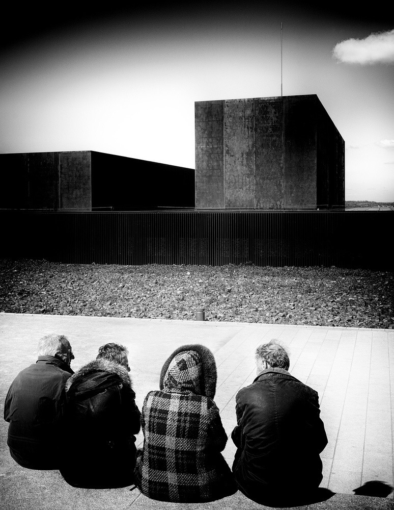
Had a great day out with Diuk shooting for this. It was taken outside the Pierre Soulages museam in Rodes southwest France, art can't get any colder than Pierre Soulages so Paul's wonderful comment is astonishingly accurate. If I could see through the eyes of one photographer here it would have to be those of Ubique's so it is with great honor that I'll be sucking his shiny new thumb. Thank you Paul for helping us see beyond that thin layer of shallow plastic perfection and guiding us to the more subtle and profound depths of the moment.
Statistics
Place: 4 out of 86 Avg (all users): 6.6795 Avg (commenters): 7.9200 Avg (participants): 6.8491 Avg (non-participants): 6.3200 Views since voting: 2295 Views during voting: 210 Votes: 78 Comments: 32 Favorites: 5 (view)
I did give this an 8, but obviously I need to open my mind to the power of ugly vignettes! congratulations on getting the blue thumb for this, the ultimate achievement in this challenge.
You know what I'm not surprised this got Pauls top pick, I could see him taking this, and almost thought he did, before I read that he didn't enter. WD on the HM!
Now why on earth would these guys sit in front of that unattractive building I don't know, but it does make for a pleasant looking image, that one cloud really makes it, bump.
9 from me that vignette at the top is sublime, the tones are crisp and sweet and the middle jacket pattern against the dullness of the other three jackets boom. love the contrast of light and dark, the bright pavement and the dark looming brutalist concrete structure hope vs dismay and theyre the judging panel deciding on who wins.
Beautifully wrong & ugly. Even instead of odd people/buildings. Skewed horison. Vignetting taking over too much. Harsh light. Backsides. And I do like it such a lot, for all of the combined things done.
This is my top pick; of all the many terrific pictures in this challenge, this is the one I'd most like to have taken myself.
On the superficial level, it employs most of my favourite things: B&W, deep contrast, mad vignette, grain. Plus some smaller sly pleasures ... the cloud poking in like the finger of God, and the shadowed profile at lower right, snooping on the conversation.
Scrape a layer deeper and the subtler delights include great blocks of shape and tone that introduce a nearly abstract motif. You could view it from far, far away and it'd still be interesting because of the purely graphic characteristics.
It's also something of an anti-photography photograph in the absence of any faces. We expect faces, expressions (think of selfies, and those pouty-face things). Instead we're left to draw those identities ourselves. We get to choose who the players are, and what's happening.
What I choose to see is two older couples sitting on a bench in an art gallery (apparently a cold art gallery), looking at a gigantic and brutal floor-to-ceiling modern artwork. And they are all glancing sideways at each other, hoping that someone will soon suggest moving to the gallery cafe for a cup of tea.
But I could be wrong of course. Maybe there is no gallery. No tea either. That's the great thing about good art; you imagine what it means, what it is, and you could be wrong. Imagine a world where all the art was so simple and unequivocal that the viewer could NOT be wrong. I wouldn't want to live there.
I offer you the first ever Order of the Blue Thumb, and my thanks for this thrilling photograph.
For me, this is a surreal depiction of human reverence for superhuman accomplishment or godly representations. Reminds me of the movie "2001" when the photographers approach the monolith. Maybe not so ambiguous or cosmic as I find in Ubique's but a strong image nevertheless. 8
Four Eskimos on an ice floe staring at the Kaaba and neighboring Costco backed by a nuclear mushroom cloud. Need I say more?
Well, maybe. This seemingly normal moment is actually an unplumbable mystery. Have to move on to other matters. It's a wild and very enjoyable image. The composition is odd but sterling. The juxtaposition of sharp lines and soft curves is quite satisfying. The upper vignette works it's magic in a way I could never imagine.
Many happy returns.
Very nicely framed, they against the light field of cement, some texture and lines, and impressive-in-their-unimpressiveness geometric structures. Buttery smooth.
Contrasts. Starkly inanimate w/ warmly human. Dark w/ light. Linear w/ curves. I regret the very strong vignette at the top. Wonderful for both design elements and story suggestions.
excellent title and, yes, the vignette might be too pronounced and you might have wanted to place it on all sides as well: in for a penny, in for a pound!
They sit transfixed sharing perspectives on the forms in front of them - separated by the moat of doom!
The arching partial vignette a sign of menace. They are at a safe distance here, but only just. If this had an audio track, it would be the sound of an apocalyptic siren.





 Add photograph to your favorites
 Add photographer to your favorites


 Photographer found comment helpful.


