...from Critique Club...
Hi Van
FIRST IMPRESSION:
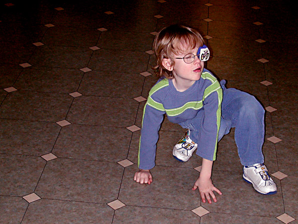
Very snapshot looking.
COMPOSITION:
Very good. Subject placing is good, the only thing I would so is move to the left so that the tiles align with the bottom border (horizontal) :)
TECHNICAL:
I think your low votes came from your technical execution. As soon as you use a onboard flash, you are doomed! This will almost always make it look like a casual snapshot. I suggest you use other lighting (mounted lamp, window, sun) to make your shots more dramatic. Looking at your other photos, I think this was a last minute thing and it's more about the story behind it than the actual photo :|
ARTISTIC:
N/C :)
OVERALL:
I know you can do better...you have done better...CONGRATS ON THE NEW MEMBER OF THE FAMILY!!!!!!!!
Cheers and good luck in the future challenges. |




 Add photograph to your favorites
 Add photographer to your favorites

 Photographer found comment helpful.


