Challenge:Windows and Doors (Classic Editing*) Camera:Kodak DX3900 Location: Fall School Business Center Date: Jan 22, 2003 Aperture: F 2.8 ISO: 100 Shutter: 1/181 Galleries:Abstract Date Uploaded: Jan 25, 2003
CC: I'll split this comment into two parts. The picture, and the post processing.
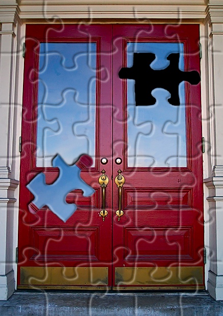
The picture I like, a strong, red door with good cool contrasting blue sky reflected. It could perhaps be a touch more saturated to give more punch but a well composed shot. The handles are crisp and sharp and add some good details. Slight barrel distortion on the edges, but that is to be expected. Could have been straightened up if you had wanted with a freebie tool like PanoTools or similar, but it doesn't detract too much from what is a good shot of a door.
The filter I'm less fond of. In general, I'm a bit jaded about filters that are just applied directly to a scene. I don't really feel a whole lot of connection between the underlying subject matter and the filter that has been applied - what was the motivation of using this puzzle filter ? If there was something distinctive about the 'missing piece' then perhaps it could be more integrated - as an allusion to something being disconnected or out of place, but here it just looks gratuitous.
The selection edges around the piece are a bit ragged - perhaps some feathering of the selections would have made for a cleaner extraction of the piece, although that is quite difficult to do so you've done well.
In general I've found the photoshop filters can be really effective if used either indirectly, to a mask or adjustment layer, rather than straight out of the box onto the image, or if used in a really sympathetic way that matches well with the subject matter. I don't quite think you've pulled that off with this one. NB None of this is sour grapes because your picture beat mine by one place ;)
the effect has some basic appeal, but it has nothing to do with the shot in specific and could have been done to just about any shot with equal value. The shot itself in question seems pretty well technically executed but doesn't seem to offer much uniqueness, leaving that to the effect. Unless the effect relates to the subject in some way, I don't see that as a valid means of producing a worthwhile photo. 4
very interesting use of digital manipulation. The cut of the puzzle piece is a little rough though.. .maybe cleaning that up a tad would help a bit :) - setzler
How cool is that??! I love the whole look! Nice color, and I love the crispness of the architectural details. The only thing I'm "iffy" about is the loose puzzle piece - it seems to be floating in the air, and I would have expected to see it laying haphazardly on the ground in front of the doors.
sweet!!!!!! the photograph would be cool even with out the puzzle--i really like the contrast of the red door with the surrounding neutral colors. but of course i have to know how you did the puzzle! very creative! 10
This is a great idea and I wonder how well it will do. I would have cropped some off of the top because the puzzle piece lines just stop which almost ruins the illusion.
I have a number of comments and I hope they don't come across too harshly. First, I'm not sure if the photo itself has that much interest to it. Second, there are a number of filters that shouldn't be used except in extreme cases and usually only with a lot of other work involved -- I think maybe the puzzle filter is one of them. Finally, the selection around the puzzle piece is a little rough -- it may be that you need to spend a little more time learning how to use those selection tools. Generally speaking, humans want to see light from the top down (something we're conditioned to because of the sun) -- so while the drop shadow on the puzzle piece was a nice idea, you might want to switch it so that it's on the opposite ("bottom") side of the piece -- which it looks like would help it match the lighting on the rest of the puzzle pieces.
what a great idea for the challenge! i think you did this with software rather than taking a photo of a jigsaw puzzle, right? like the colors, good photo. personally, i would've cropped just a tad tighter (less of the step at the bottom, maybe even remove it altogether), and a little more off the column on the left, compare the columns at the top of the pic, they are not symmetrical. lastly, the black where the puzzle-piece is missing looks a little uneven around the edges. not sure whether that's the software or something you have filled in manually, so it's difficult to comment what i would change. overall, i really like this shot :)
Nice job with the puzzle thing. Its one way to spice up a relatively uneventful pic. There are some really nice colors there, just not much of note besides that. Great creativity!! - Inspzil





 Add photograph to your favorites
 Add photographer to your favorites


 Photographer found comment helpful.


