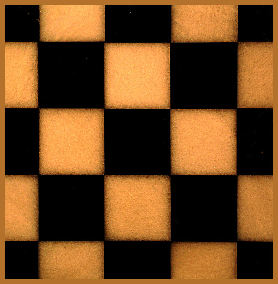
This is symetrical but it somehow looks crooked, leaning to the left? I dunno, I like the colours and the graininess of the squares. Good luck. Jacko. 7
This is strange. It appears to be out of focus, but with closer looking it is not out of focus. The black bleeds into the orange. This plays tricks on my eyes and I'm not sure how I feel about that. First glance says 5, but further looking says 6 for the illusion. Going with further looking.
Composition: Nicely symmetric
Technical: Good colour and uniform lighting.
Meets challenge: Yes
Overall impression: Maybe a secondary subject bottom left would look good? 7
The contrast in this is nice, but it is lacking a something. Perhaps if you had placed something round on it to highlight the squares even more through contrast. Or placing something square on it. Either way would have help add some depth, I think.





 Add photograph to your favorites
 Add photographer to your favorites


 Photographer found comment helpful.


