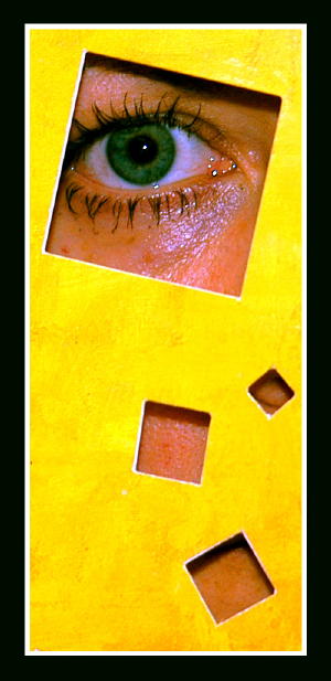
This plays with the mind and eyes. It appears to curve on the left edge, which we know it does not. It also appears to tilt to the left, because of the placement of the squares inside the yellow. I don't like modern art but this is good art. One nit pick - the eye should have been centered in the square. There's space on the nose side and almost cut off on the other side. Beautiful green eye. Well done.
Very, very nice. Beautiful colours. Abstract, yet we know exactly what we're looking at. My first 10 this week. Keep up the god work and good luck. Jacko. P.S Love the shape of the photo + the frame; they really work nicely together. Jacko. 10
Wow, a very creative idea! The yellow paper and the green eye are working good together. But IMHO there is some space for improvement too. You should have used some powder to eliminate / decrease the shine around the eye. I also don't like the shadow of the paper above the eye and the eye could have been brought into a sharper focus. Nevertheless great idea, good luck for the challenge!





 Add photograph to your favorites
 Add photographer to your favorites


 Photographer found comment helpful.


