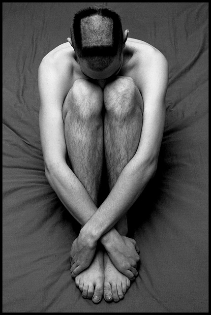
I was going to get my hair cut, and while I was at it, I thought it would be cool to turn it into my dpc submission.
Not particularly happy with this picture, actually, for many different reasons. But I did promise myself to participate in every single DPchallenge from I joined. And - considering my track record so far - I can hardly do any worse ;)
Statistics
Place: 11 out of 179 Avg (all users): 6.3175 Avg (commenters): 7.3636 Avg (participants): 6.4790 Avg (non-participants): 6.1087 Views since voting: 2381 Votes: 211 Comments: 34 Favorites: 1 (view)
That's dedication to the cause, brother. Hope you waited a while and you could have gotten a good before/after shot! I like the symmetry of the shot, and how his arms bring the focus of hte eyes down to the feet.
Composition: Good
Technical: Great. Nice border colour/size. Good pic size too.
Meets challenge: Yes
Overall impression: Can't really fault the pic, but lacking slightly from the challenge point of view. 7
OK, now that's dedication. I love the composition, with the placement of the legs and arms, however I find the hair on the legs pretty distracting: competiting pretty strongly with the square on the head. I'll give you a 9 because of its overall quality. Jacko. 9
Fantastic foto!!! Very original concept which deserves extra points in its own right. The unusual pose, contrast of hairy legs with the rounded shading of arms, the crossed wrists, wrinkled cloth backdrop are particularly outstanding visual elements. B&W was undoubtably the wisest choice. Beautiful rendered tones and minute detail. Gets a 9 vote from me... and certainly worthy of at least that from many others. Excellent work!!!
A very creative interpretation of the challenge, I like the posture of your model too. Bit IMHO there is some space for improvement. A different lighting could have made this shot more impressive. Perhaps an other and less distracting back(under)ground could be helpful too. I'm not sure, that I like the wrinkles very much. Nevertheless a very unique submission! Good luck for the challenge, I voted 7.
This is a great photo... one of my favorites this week for sure... the composition is really intriguing. I don't particularly care for the title though... I would love to see a strong title to go along with this strong photo :) = 10 - setzler
Yikes! Guess it would be harsh to rate this one low, eh? Quite the sacrifice for a challenge shot! Anyway... nice lighting... nice composure... hope it grows back :)
Bonus points for dedication. Great tones and light. I know getting the camera up higher would have been difficult, but it would have allowed you to put more compositional emphasis on the head. Very fine.
I think that this one was meant to be humorous, and maybe the joke is that the square is actually a pentagon! The subject is a bit too centered for my taste. I also find the sheet he is sitting on to be somewhat distracting. There is nice use of shape in this picture though, and there are also some nice textures in the hair. I gave it a 5.





 Add photograph to your favorites
 Add photographer to your favorites


 Photographer found comment helpful.


