Bllody hell Ben, I've just come across this on a trawl through the site (actually by way of JJ's favourites): thought I'd seen all the really great photographs on this site, but his selections are almost as much a revelation as his photos.
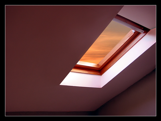
Wonderful stuff: the cleanness of those lines, the half-hidden window that makes me want to move into the shot to see what's hidden. Almost worthy of Kertesz, in the sense of finding the extraordinary in the absolutely everyday.
Composition - There are 2 things that sell this shot. The first is the color of the sky, the second is the framing. Angle has a little to do with that as well. The lightness around the window is a good lead-in to the scene behind the glass, which is fantastic, real or not. A lot of negative space around the window which I think is a matter of taste. I don't like it as well as I think you and others do. Probably explains a lot of why you got a 6.5 on this challenge and I got a 5.2. Well done!
Photography - Looks like I'm looking out my own window, except probably clearer since my spectacles are a little outdated in their prescription. Very very well taken picture and sharp as can be. Exposure is great.
Processing - Perhaps a little more of the bottom cropped to lose the crease in the wall going horizontally under the window, but aside from that, masterfully done.
Overall - A very solid shot all around. Great subject, well taken with great perspective and a good lead in with the light around the windows and a fabulous sky. Use of negative space makes this seem simple without distractions of any sort. Very well executed shot. - Bob
This certainly catches my eye. I like it a lot. Unusual angle but really works. Nice rep of negetive space too. and rule of thirds...........I just talked myself into including it with my four other 10's...........10
I love the simplicity of this shot... the lighting is excellent and the exposure is still showing the details in the dark areas of the shot... great work :) = 10 - setzler
The simplicity of your photograph makes it very appealing. I really like the angle you took your photo, the lighting, the way the lines work together and the shapes and forms. The colors really set it appart from other works. Excellent! (10) John Gill
I really like this shot, except for the composition. I would have much preferred to see the entire top part of the window cropped out, just below the metal hardware, giving the shot a richer, more abstract feel.






 Add photograph to your favorites
 Add photographer to your favorites

 Photographer found comment helpful.


