FIRST IMPRESSION... well I was definitely shocked by the score. There were a lot of great entries in this particular competition, which was of course to be expected considering anything went in this challenge. Still, I thought this photo got a lower mark than it deserved.
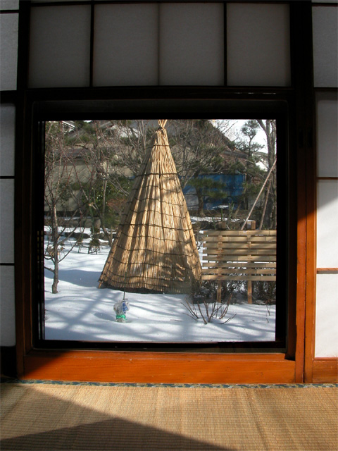
COMPOSITION... The frame within a frame is a very strong composition element, and I find it works very well here.It strongly adheres to the theme , since it seems you captured both a door and a window... I think the horizontal lines in the wall, around the frame, seem to give the semblance that they're "supporting" the frame, and strengthens the center of the image. The shadows on the floor give you something interesting to look at in the frame as well. As for the actual image you are framing, it is unique and interesting to look at. i think if you could have angled yourself to compose the scene with the tepee and bench following the rule of thirds, it may be more pleasing. I don't think a central composition though hurts it that much in this case because the rest of your photo is already centered and you stick to that theme if you center the teepee. I suppose either way - the difference is subtle.
TECHNIQUE... All I can offer here is the large shadow diagonally cutting through the frame. It distracts from an otherwise very well executed exposure. Fill-in flash may have worked well here, but I am no expert in flash photography. The light entering this room would have to be at another angle to give you an evenly lighted frame. Well, at least you can go back and make some DPC-illegal photoshop edits to correct this... If you haven't done so, and are interested in the procedure, you can private me. Its not long or hard - I did a quick correction and put it in //photos.yahoo.com (folder: DPChallenge Critiques).
This is a little bit busy and confusing. It also seems slightly slanted, or maybe it's a bit of perspective. The walls seem Japanese or something, and th wigwam outside is interesting, but it's hard to mentally process what's going on in this photo.
If you could've gotten the top of the teepee, I think it would've been preferred. That little bit of difference would've made this look like a picture on the wall as opposed to a door, even with the shadows the way they are. It looks not square to the pic but I think that's the angle from which it was taken. Nice shot - Inspzil
I like the fact that you shot from the inside instead of outside like most of the other photos. The lighting really makes a difference and helps the image. (8) Jojn Gill
I like the scene outside the window, with the light and shadows. I would have much preferred a close up on the window cutting out the distracting surrounding areas.
Nice conglomeration of shadows. Maybe could use a bit less of the dark part at the top and a more centered crop on the sides, and possibly a better angle to see all of the teepee thing. I'll be looking forward to seeing where this was taken ... looks like Japan.





 Add photograph to your favorites
 Add photographer to your favorites


 Photographer found comment helpful.


