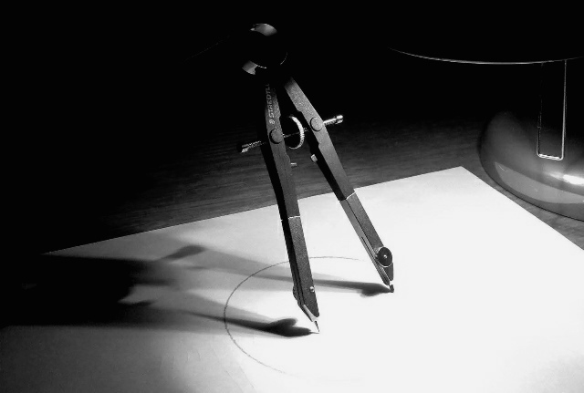
I like the element of the compass, but maybe it would have been better laying down. It kind of bothers me that there is a partial arc but the point is not centered in the radius ( is the point even touching the paper?) But still, there are strong elements here and I am giving it a 7.
hey you used the B&W one nice choice but there are things that could havebeen done better an more through like the point of the compass is off center of the circal and one can see some of what ever you used to prop up the compass with.
Also those distracting shadows that is what i was talking about w/you.
Not your stroungest but good luck w/it anyway.-BC






 Add photograph to your favorites
 Add photographer to your favorites

 Photographer found comment helpful.


