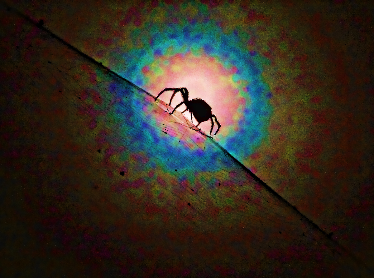
I know this will be too much processing for many and it is really pushing the boundaries for what I believe is acceptable. I like the original shot, which appears B&W against the moon, but while mucking around with topaz I created this and liked it.
Statistics
Place: 95 out of 141 Avg (all users): 5.3407 Avg (commenters): 6.4000 Avg (participants): 5.2535 Avg (non-participants): 5.6500 Views since voting: 444 Views during voting: 196 Votes: 91 Comments: 6 Favorites: 0
This one actually gets way more interesting the more I look at it... probably not an easy capture either. Colors are spooky and it has almost a 3D look to it (not flat after all!).
Ok -- this is pretty cool. I'm curious what it would look like with more muted colors. I'm guessing it's better this way. It just makes me curious playing with it with different tones and maybe even b&w. This works for me.





 Add photograph to your favorites
 Add photographer to your favorites

 Photographer found comment helpful.


