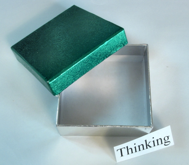
The thread started by Antithesis (Voting Milk?) gave me the idea for this photo. "I was hoping that more people would think 'outside the box' on this one.". So I give full credit for the idea to him. :)
While doing that, I'd like to give credit to my mum for the box used. I like that box.
Statistics
Place: 84 out of 179 Avg (all users): 5.2327 Avg (commenters): 6.0556 Avg (participants): 5.2857 Avg (non-participants): 5.1667 Views since voting: 1349 Votes: 202 Comments: 20 Favorites: 0
Composition: Placement of the objects is done well. Green attracts the eye, which is then led to the open box, and then down to the sign.
Technical: The background should be whiter.. perhaps better lighting and increasing the exposure value would be helpful if you have the ability to do that.
Overall: I like it, and personally scored it well because of the idea. Still, it would've scored higher if the technical aspects were tuned better. Great job! Look forward to more! ;0)
Well done intellectual comment. I should give you a 10 just for that (haha). The spanky colors certainly attract lots of attention. But my fav visual element is the really cool color contamination among the shadows from multiple lights. The subtle color interplay among reflections form the silver part and green casts from the upper lid are simply mahvelous my dear. Good tight composition and suitable DOF. Superior creative input deserves much applause. Great show!
Great creative idea and good composition. I don't really care for the lighting, which causes greyness on your working surface (but that's just me). Perhaps a different color background would improve this for me.
Nice photo with the exception - and you've probably heard it over and over - the "Thinking" sign is not cut straight. Really distracting - holds your attention - really stands out bodly. I hate it for you. Seriously, because without that it is a very restful and relaxing photo. Really like your choice of colors.
If i get what you are saying in this picture the image is very nice ( Thinking out side the box) I think by moving in a little closer to the box you would have created a littlemore intrest. And also by using a different color for background would have made thebox stand out more. Nice Work
Cute composition, clever. I don't see any squares. Just kidding. I think I'd like to see the back ground pure white, looks a bit too dead. Good job and good luck. Jacko. 8
This is a clever picture which works on a number of levels. Although the individual components are quite ordinary (boring) you've brought them together to make an interesting composition to make a statement. Definately a good example of thinking outside of the box.





 Add photograph to your favorites
 Add photographer to your favorites

 Photographer found comment helpful.


