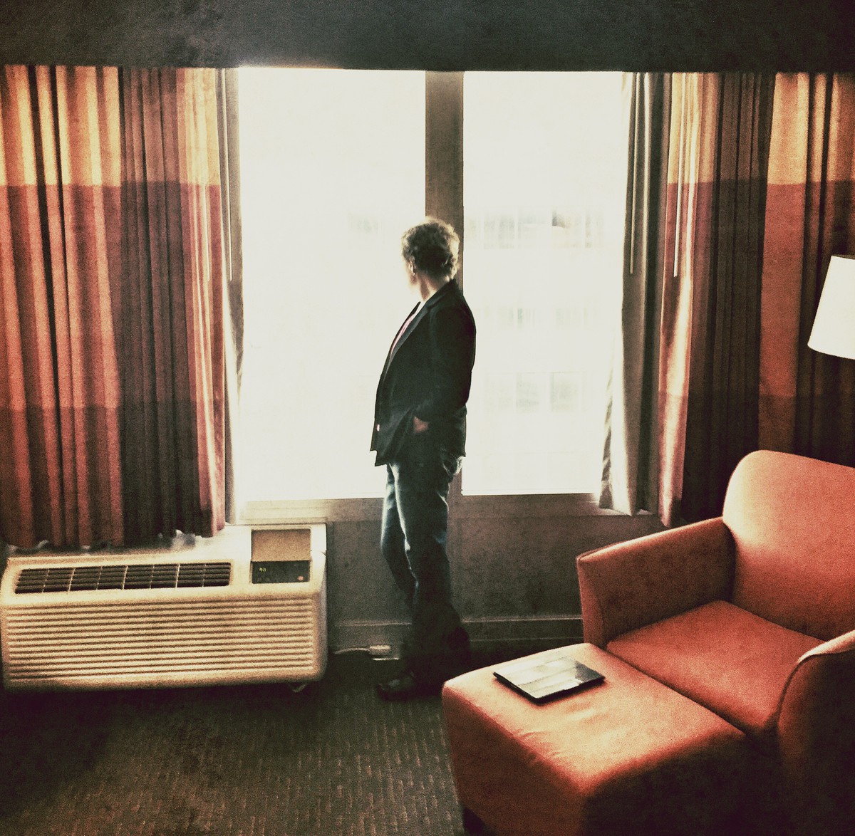
I have come back to this one so often. I love the tones, the pose, the light. I would do something really funky like lose the entire left of the frame so s/he was practically against the edge and crop down - can you get a square out of this? I know it's a no no to have no space in front of a subject but given the pose and distracted feel here, I think it could work. Six from me, almost a seven. Guessing closer to your prediction. 5.6
That must be Robert Redford in that diamond movie. I just hope the thing on the chair is not an iPad. I'm giving you a 10 for this successful creation. If that's not an iPad.
Prediction is higher, 6.46. A ribbon contender, if not killed by the texture police.
This has an interesting feel to it. I like the overall scene square crop and post processing. I am not a fan of the vertical centric subject though. I think had she been standing two steps back, it would have a better feel. Probably will do better than you think though. 5.80
I really like this and I'm bumping it to a 7, although I suspect I'm in the DPC minority. I've had 1s for the application of a texture recently. I guess 5.6
I'll agree with your prediction 5.34 here and although I'm a fan of the higher contrast light, I believe the voters here will say its blown out, and I personally feel that it is a little too grainy for my taste. it is a unique composition with a very contemplative feel to it. I will vote a six here Good Luck
The retro look, shade patterns, book placement- and especially the overexposure is nice- and unavoidable. The pieces of a shot have to work together- and they do here, the look of the subject into the longing beyond. Inevitably, you will get the "slice of life" "ordinary and mundane" comments, mostly because of the giant heater /a/c unit filling most of the frame.
I gave you a 6. Others will profess their love for such "casual brillance" in their words, and give you a low score, so, 5.3 sounds about right.
I love the colors in this, and at first it seems very intriguing… but then it doesn't really seem to have anywhere to go. Strong initial impression, but they story seems to end there.
Composition-wise, I wish the person were at the right window looking out instead of centered. I really don't mind centered compositions, it's just that it feels a little claustrophobic, like there's not enough space. Doesn't make any sense, I realize, it's just the feeling that came to me. :)
I think it deserves a score higher than my guess, but I'm guessing 5.6 from the collective.
This is the type of image that goes unappreciated at the time of it's creation, yet ends up in art and photography text books and lauded as being representative of the great artist's life's work. I would imagine your guess to be an accurate representation of the dpc audience, however I would score this higher. 5.3468
I gave this an eight and may come back and bump. A common hotel scene but somehow doesn't look so common. I like that the subject is centered. Love the cut off lamp. Perfect grain. Love the burnt out window. Very pleasing overall. I predict 5.3.
Hello, I voted a few days ago, now returning for comments. I think that you estimated your score a little high, I gave you a five but I predict that you will finish at 4,4891





 Add photograph to your favorites
 Add photographer to your favorites


 Photographer found comment helpful.


