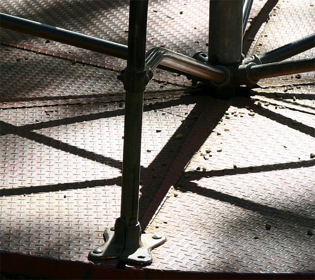
Great title. I like the angle of the light and mix of shadows. I think the image would work better as black/white, and with a wider angle, rather than square.
Sorry but IMO you should have thought harder about a better title for this shot, it´s way to long and it´s pretty much horrible. The shot however is pretty good, the steel is a little overexposed but I like it.
I like this school playground shot. I remember the damage brought to me and classmates in my gradeschool. Like the lighting.color, and shadows, as well as the tight crop to the center pole. Good idea and shot ;-)
I like the abstract feel to this. The shadows are nice as well. One nitpicky thing is that I would have rotated slightly counterclockwise to straighten the bar in the foreground.
I really like this photo. I'm a fan of views like this one where shapes and textures play a dominating role in the image. Excellent work... one of my favorites this week...







 Add photograph to your favorites
 Add photographer to your favorites


 Photographer found comment helpful.


