*Hello from Sid and the Critique Club*
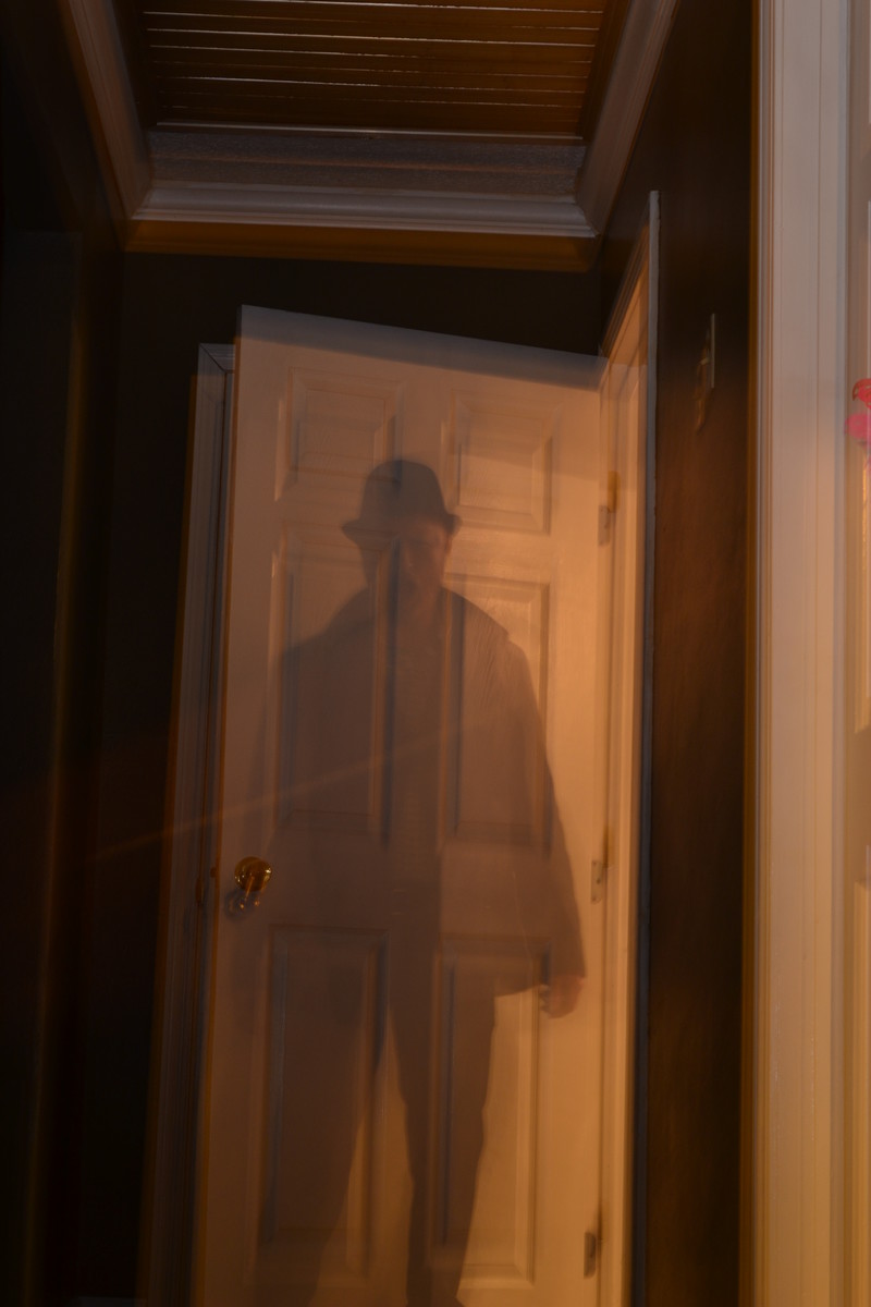
A reasonable attempt that meets the challenge well.
You've achieved the desired effect on your subject but he just feels rather static and uninteresting. The lighting is uneven with the right of your 'ghost' much lighter than the left with a clear dividing line just right of centre top to bottom.
I'm not sure if you intended to have a ghost of the door too but the double exposure on the door for me spoils the effect in a way that is detrimental to the end result as a whole. Also spoiling the image is the lean to the right, it would benefit from straightening. A crop excluding all of the right up to the darker doorway would also help. I don't want to appear too negative, your commenters and voters have obviously appreciated it more than I but my suggestions are the things that I would have done to improve it.
Thanks for your submission, Sid |





 Add photograph to your favorites
 Add photographer to your favorites

 Photographer found comment helpful.


