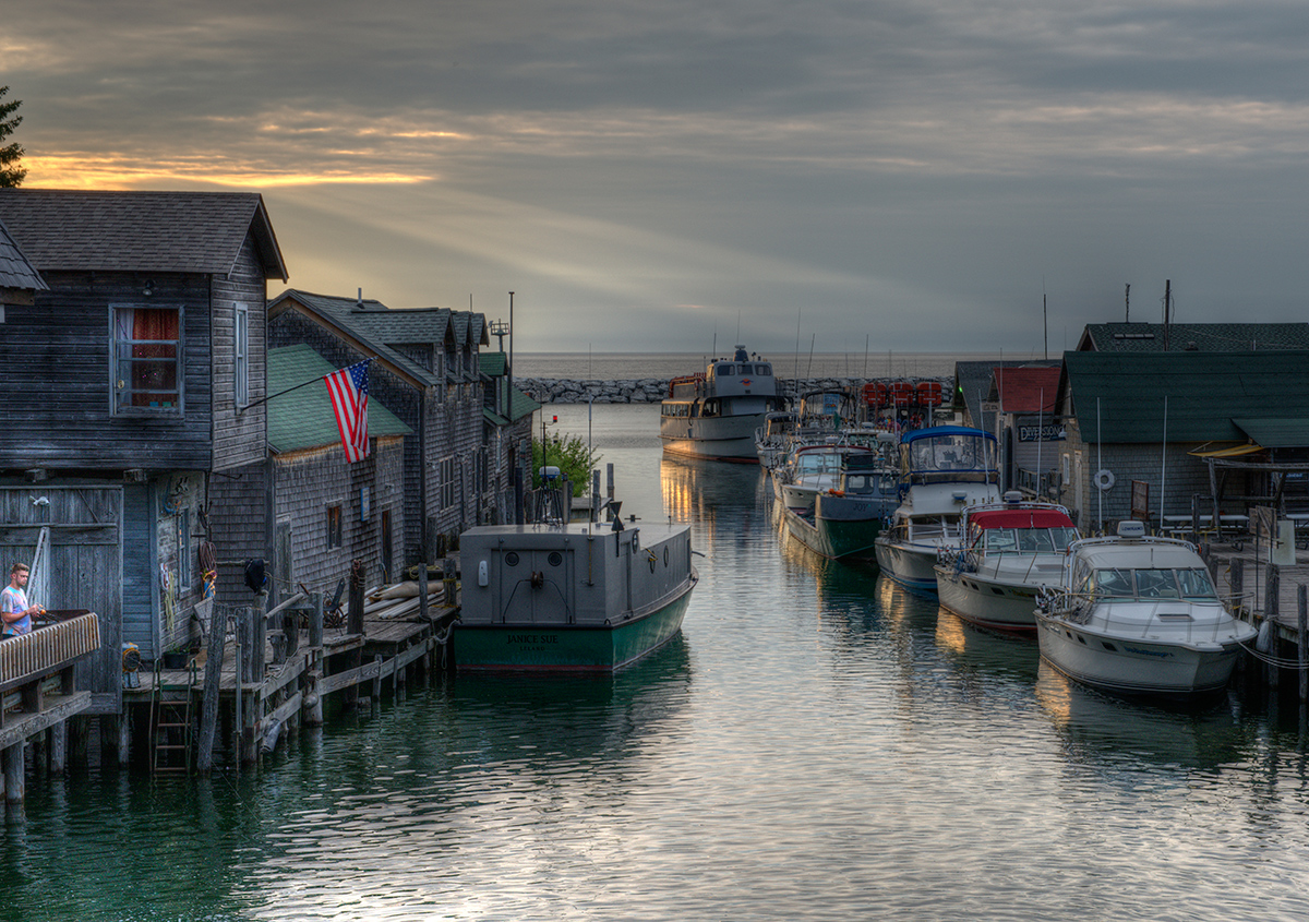
This tranquil scene is all about the quality of light, the gentle rays leading us from bright sunlight to the inner portion of the scene and the illuminated hulls reflected in the water, the very things that obviously attracted you in the first place. It's a shame the boat on the left is such an ugly beast.
Apart from the gentler brighter light the scene is generally low key and fairly monotone, verging towards black and white with subtle colouring. The only parts of the image that break that quality are the American flag on the left and, this is where I have the only problem with the image, the person on the left. He is so extremely positioned right on the edge of the frame that he would be better cropped out. If your original has more scene to the left then he should be included as his presence definitely adds but not in this extreme position. If he were to be added with space around him then he also ought to be dodged to subdue his colouring more in keeping with the rest of the image.







 Add photograph to your favorites
 Add photographer to your favorites


 Photographer found comment helpful.


