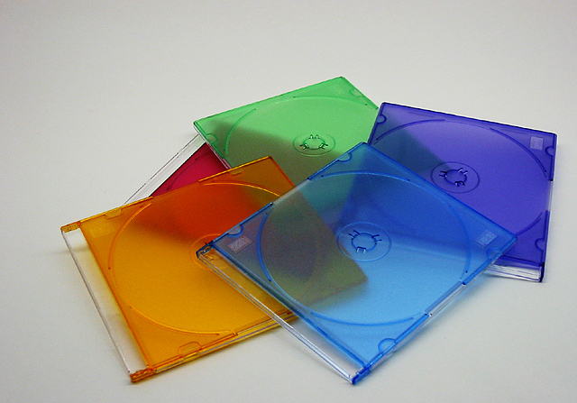
Well, the color choices are nice. The lighting is good.
The sort of detached haphazard placement and distance from the camera doesn't really add.
There is what appears to be jpeg artifacting.
As someone else said, it's a subject that was done by many.
For me, I think the main thing is that there is nothing really 'happening' in the pic. It tells no 'story', and it's not objects that are interesting enough just to be 'on view' (ie like a ming vase). I like to try to either use ibjects that are interesting looking on their own or create some kind of theme.
Good use of colors. The composition seems a little off to me. I think it either needs to be centered more, or more in the right of the frame so that soem of the cases are "hanging" off.
Good choice of color in your submission. Somehow you had bad luck that the topic is choosen by other submitters. This usually leads to lower votes. The colors could be more vivid and the image itself a little brighter though. I like the arrangement of the disk covers and the simplicity of the picture: its a one-view-fully-captured-image.
Red Orange Yellow Green Blue Indigo Violet (I still remember Roy G. Biv from elementary school) - seems like you're missing a couple of colors. But I like the overall effect of the photo, and the uneven cropping.





 Add photograph to your favorites
 Add photographer to your favorites


 Photographer found comment helpful.


