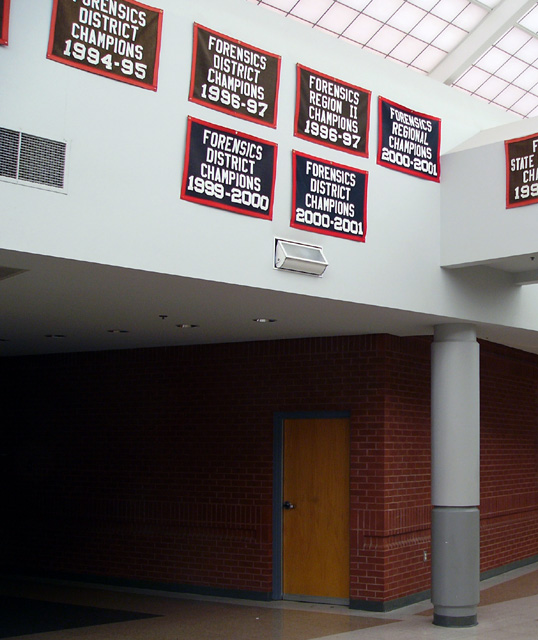
I think the crop on this photo could have been better. I don't like the way the sign at the side is cut half way through, and on the other side of the photo, there's just a bit of a frame for another sign. They'd have been better cropped right out in my opinion.
The bottom half of this picture doesn't add much to it, I might have stepped back to get more banners, including those on the right-hand wall for purpose of adding more dimensions and depth, and then cropped it to be a fairly long, narrow horizontal photo.
This does meet the challenge but it does so in a very dull and literal way, IMO. This might be of some interest to the students at this school who care about sports and want to know the recent history of their team but there really isn't anything here to attract an impartial viewer's interest. The signs themselves are not striking in any way (to me, anyway) and most of the frame is taken up with the ugly institutional building.





 Add photograph to your favorites
 Add photographer to your favorites


 Photographer found comment helpful.


