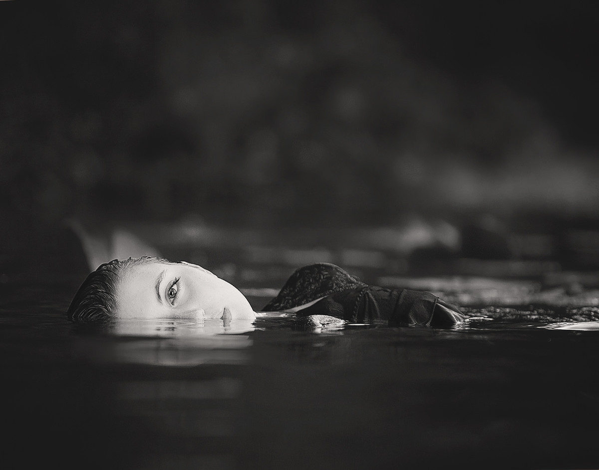
took a screengrab, played with flipping every possible way...the only way this looked even remotely close to as good (in my opinion) was a tighter crop below (starting just below the first reflection of the face, putting the head in the lower left 1/4 of the image).
I gave this an 8 and feel confident that it deserved it. I really think that just about anything else you did would've detracted overall from the score you received.
Quite lovely composition! A little too much space above her for my liking though. She's almost drowning ('scuse the pun) in empty space above her. I feel like she's battling with the space for center of attention.






 Add photograph to your favorites
 Add photographer to your favorites

 Photographer found comment helpful.


