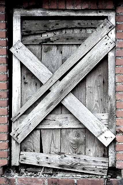
I did two things that are normally not allowed during post-processing, but where alowed this time:
1) I selected the upper row of stones and changed the levels to lighten up shadows.
2) I used the clone-tool to remove some disturbing pieces of grass in the lower-right corner.
To give the photo more visual impact, I increased the contrast and lowered the saturation.
Statistics
Place: 11 out of 86 Avg (all users): 6.5444 Avg (commenters): 7.0000 Avg (participants): 6.5079 Avg (non-participants): 6.6296 Views since voting: 1587 Votes: 90 Comments: 17 Favorites: 0
I think you did an excellent job with this composition. I love 'rustic' look and feel in a photograph. I think your choices of desaturation work very nicely here as well, along with the bump in contrast. The contrast adjustment gives the grain and texture in the door a good 'push' and brings those elements to the forefront of the photo. My mind wants to see a "keep out" sign on this door :) Maybe this is a door to an abandoned warehouse or storage building of some sort.
This composition contains nice diagonals and triangles. My eye seems to keep coming to rest right in the center of the X on the door...
There are a lot of photos similar to this one. The textures are great, and the high contrast sets them off nicely. The colours are a little washed out though.
I usually say try to get a little closer with most shots, but I will say with this one that my personal oppinion is that you need to back out a little bit so the Image has room to breath so to speak. Colors are good, I would like to see more of the frame.
Excellent take on the challenge. One of the things I challenge my students with is to make their pictures look 3 dimensional. And never take a picture straight on, try to find a piont of view that is more creative. i.e. shooting up-down-or through something. A suggestion might be to put a potted plant in front of the door. New verses old and it would give it dimension. Just a thought. (8) John Gill
I like the tone that this sets, the starkness of it. I do wish that the pic was opened up a bit, not cropped so tight, so we could see more of the bricks around it. This is definitly interesting.
I love the composition and the colour. The way you have managed to have all vertical and horizontal line perfectly alligned is incredible, I know how difficult it can be. The subdude colours I think is what really makes the image stand out for me though. A 10!





 Add photograph to your favorites
 Add photographer to your favorites


