Greetings from the Critique Club!!!
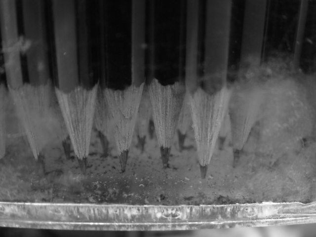
let me start by saying it's a great idea, but there is some strange stuff going on in the forground of the image. It looks as if you shot this photo though a glass? Is that frost that is softening the focus on the right and left of the photo? I also find the bottom crop a little distracting. If the bottom was cropped a little tighter, it wouldn't feel so "unbalanced" especially since this is such a "balanced" shot.
I understand why you chose BW, but I really think it would have worked much better in color. The sharpness in the center pencils is good, but I really think this scored as low as it did because of the distracting blur in the forground. I think that one aspect alone dropped your score.
Overall, it's a great idea, and a nice shot!
Keep it up, clean it up, and you should be scoring higher in the future :)
E
cool itz sortov an illussion i couldn't make out what i was looking at, for about 5 seconds - good idea im guess your getting slaughted with this one since no one can probally be bothered looking at it for 5 seconds so i give you a [8] to help you out
it is hard to tell what is going on (what the pecils are in) i probably would have cropped off the bottom. the scratches take away but they let you know your looking trough something. nice focus on the pencils
How many pencils were harmed in the making of the photo? I like this image, it makes you think. Would like more if the photo was cropped tighter to the bottom edge, just at the line cutting out the black and gray underneath.






 Add photograph to your favorites
 Add photographer to your favorites


