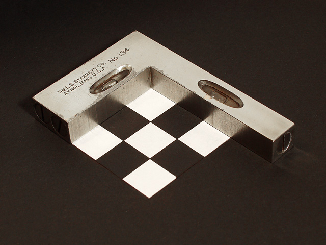
When I saw what the challenge was I immediately thought fo doing something with a square, the tool. After a couple of days thinking I came up with this idea. It was taken with the aid of a single photo-flood and regular room light.
Statistics
Place: 23 out of 179 Avg (all users): 6.0503 Avg (commenters): 7.4444 Avg (participants): 6.0536 Avg (non-participants): 6.0460 Views since voting: 1208 Votes: 199 Comments: 21 Favorites: 1 (view)
The Critique Club and John Setzler:
Hi John,
Thanks for the in depth review of my "Square....And....Plumb". You have pointed out one of the things that I was really working on, and that is the reflection of the squares in the square. some of the pictures that I took which were very underexposed gave a real eerie look to the reflections. When I improved on the exposure I lost that wondeful effect. I tried a lot of different angles and light positions and could never get it back. When underexposed it looked as though the white squares were windows with light emitting through them on to the square. About the crop I tried several different crops and settled on this particular one due to the vertical line made by the square pattern, keeping them looking as square as possible. The picture could have stood being cropped closer but for some reason I kind of liked the suspended look so I went with it.
I always appreciate you opinion and great ideas and thanks again for a super critique.
Dick
Hi Autool.. it looks like I get your image two weeks in a row :)
I really appreciate images like this. It fits nicely into one of my favorite themes of 'form and function'. ...what makes things work... how things 'fit' together... sharp definition... cold steel... I don't know what it is about the concept, but I like it.
In photographs of this nature, tack sharp definition is important and you have captured that well here. Your command of the camera is well noticed in this image and your past images also.
What would make this a stronger image? Hmmm... There are two elements in this image that I would have worked with myself... I probably would have cropped tighter to start with... actually framed this tighter with the camera. Your square and checkerboard is 'floating' in space. There is nothing wrong with that.. just my personal preference. I would have possibly even clipped onto the square with my crop. Secondly, I would have possibly pursued a lower camera angle. The reason for this is that I believe you could have made the reflection of the checkerboard play very nicely on the metal square. You already have a nice reflection of your black checkerboard squares on your squares... could a deeper reflection create more awe in this photo? Maybe... just a thought :)
Your use of diagonals here is perfect. Diagonals always create a stronger composition for my eye. I'm trying to decide about the centered composition... I can't make up my mind how well that is working for me. I think that the tighter crop that I mentioned earlier would releive some of that by removing some of the extra negative space...
Keep up the good work... I'm looking forward to critiquing some more of your photos :)
Very creative image. I love the black and whites with the chrome. These work very well. The composition is brilliant also. I love how you have highlighted your image with the black background. Almost seems like the white squares just hanging there. EXCELLENT JOB!! GL 10
A great tool. Wish your background had been light so the whole tool could be seen. That's my only complaint, but it does make a big difference to me. From a 9 to a 6.
I think that the black background you used made this picture very intresting. If another color was used i done think that the intrest Nice work on getting the colors very clear also. Nice Work
I really like how this pic is "true"ly square! The color is great, and the contrast between the squares and the square (with the round windows and the round hole in the end) makes for a great subject. 10
Clean, sharp, well lit, great tones and reflections plus multiple levels of meaning. Nice. The only fly in the jam, IMO, is the somewhat static centered composition.
Very nice. Could be used in an ad... I'm tired after a hard day, so I can't think of what KIND of an ad, but it's definitely extremely well done in a technical and compositional sense. :) (9)
Witty compostion and everything is technically correct aside from the compression artifacts in the gray area. Seeing as the photo is only 82.31K this could have been preventable. Yet it does not detract at first look for me. 8






 Add photograph to your favorites
 Add photographer to your favorites


 Photographer found comment helpful.


