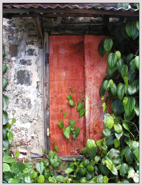
Composition (content) The right side looks really nice, red vs green and the interesting foliage. On the left side I'd rather see some more of the plant or none at all. Problem of a tighter crop is that you get such a stretched in height image. That could be overcome by cutting of the gulf-patterned part of the roof and leaving only the carrying part. I just tried it and I don't think it hurts the photo much.
Camera Work (Technical) Good exposure and focus. Sharpness needs dome post-processing. The wide aperture has caused the roof to be out of the field of focus. 1/800s is enough to step up to F2.8 @ 1/400s or F4 @ 1/200s. Colorbalance is great.
Digital Processing (technical) The only improvement I can think of is some unsharp mask. I tried 140% 0.4 1 on it and it looked much sharper. But sharpness is a personal preference, perhaps that you like the soft look more.
Oh dear. This is another photo that I find too beautiful to give anything lower than a 9. I've been too soft on this challenge! The colours and textures of this are really lovely, and that sweep of green vine just tops it off.
Good lighting, though I think I would have liked to see some "fill flash" to fill in the shadow at the top; decent composition. Love the combination of colors, and the look of the bright new leaves against the old masonry and wood. On second look, I am rating this higher than I did at first - I really like it.
I think cropping it so that the overhang at the top and the ivy at the right didn't show would make if feel more balanced to me. As it is, I feel like it is a little tight. The contrast of the red and green is nice.
Nice color combinations. I like the way the plant wraps it's way around the door forcing our eyes to follow. As a straight picture of a door this is definitely one of my favorites. John Gill





 Add photograph to your favorites
 Add photographer to your favorites

 Photographer found comment helpful.


