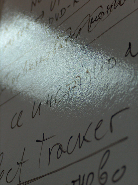
Just not a strong photo for the challenge. It's too close to the board it seems, and the lighting looks unbalanced, too dark for the top and bottom, and too washed out in the center from the reflection.
This doesn't do a lot for me...I have no idea what I should be looking at here and it doesn't look like a lot of planning went into this shot. What were the reasons you included the things in this photo that are there? Why from this angle? Why include the glare? These are all questions that seem unanswered...






 Add photograph to your favorites
 Add photographer to your favorites


 Photographer found comment helpful.


