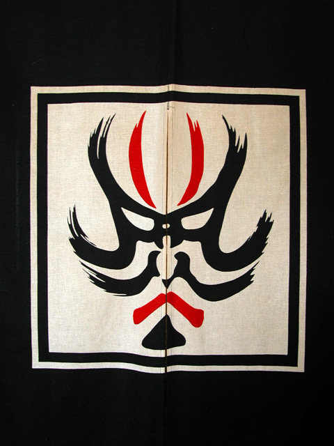
Composition - Being half Japanese, I can appreciate this kind of curtain. I've had a couple of them and I'm sure I still have them packed away somewhere. This is a little less ornate than the ones I have, but no less interesting. The first thing I notice is that this is not hanging very straight. There are large wrinkles that show around the perimeter of the curtain. Mine were quite stiff and would wrinkle only if kept improperly. The bigger problem with this composition is that it really is just someone else's art. There are ways to portray this as part of the composition but I don't think that's been done here. It can be something as subtle as the angle of the photo or the lighting. But this is flat lighting, flat curtain, and flat picture.
Photography - Well taken. Nice and sharp with adequate exposure. DOF is not an issue.
Processing - If there was any, it is very little and is well done
Overall - I don't like this kind of picture, which pains me because I do like these curtains quite a bit. If it were more than duplicating the image on the curtain, I think I would feel different. But this is a catalog type portrayal of the curtain and I don't feel that it is an appropriate subject for a challenge like this. I admit that I am a bit biased in this way, but I believe that as photographers we have some unwritten rules we follow every time we pick up the camera. This is one of mine. - Bob
Nice contrasts. IKEA could sell posters like this by the ton. Would improve by: 1. centering from top-bottom; 2. either enhancing or eliminating the wrinkles. Very nice. 8




 Add photograph to your favorites
 Add photographer to your favorites


 Photographer found comment helpful.


