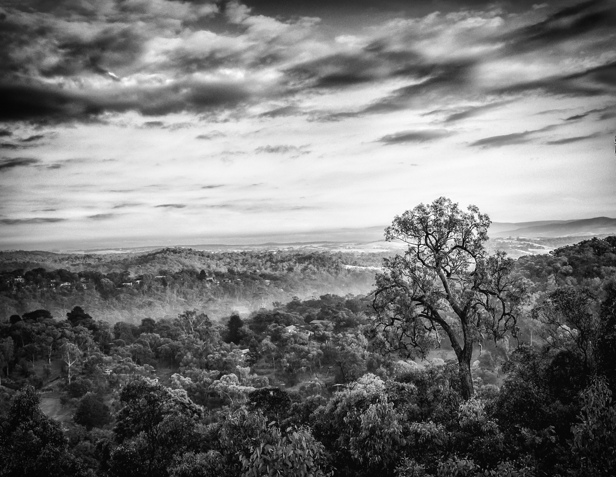
Damjan, I don't agree. To me the horizon is completely secondary in the image. The composition has three distinctive layers, with the line of the fog in the valley being much more important than the faint horizon :)
PS Robert, still don't agree but thanks for the comment
Statistics
Place: 4 out of 48 Avg (all users): 6.9643 Avg (commenters): 7.5000 Avg (participants): 6.8529 Avg (non-participants): 7.0400 Views since voting: 1993 Views during voting: 215 Votes: 84 Comments: 12 Favorites: 1 (view)
one of my 2 9's, love the scope of this image with the strong dominant subject seemingly towering over the others, almost surveying the landscape for its own reasons
Nice tones and crisp details, but why, in God's name, is the horizon in the dead center of the image? It confuses me as a viewer and distracts me from that "One Tree".
As i write this comment, the image is scrolled down so the top half of the sky (or the top quarter of the image) is cropped out. It's a totally different experience. It looses some of the lice clouds at the top but that's nothing compared to the improvement in the composition. It has both the Ansel Adams feel in the tonal range (that your original already has) plus that WOW effect. Try it for yourself.





 Add photograph to your favorites
 Add photographer to your favorites

 Photographer found comment helpful.


