Very nice perspective and symmetry. Not super crazy about the very bright left side and the much darker right side, but it might have been tough to add a fill light and get it all color balanced. I prefer the darker look of the right side, though.
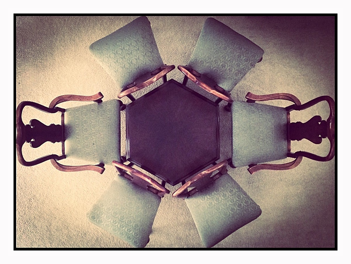
Very cool graphical set up. I like all the wood textures here. Lighting is perhaps a bit odd (or is that a hard vignette). A bit more space at the edges of the frame would help the composition. Wide white border distracts rather than helps.






 Add photograph to your favorites
 Add photographer to your favorites


