Originally posted by glad2badad:
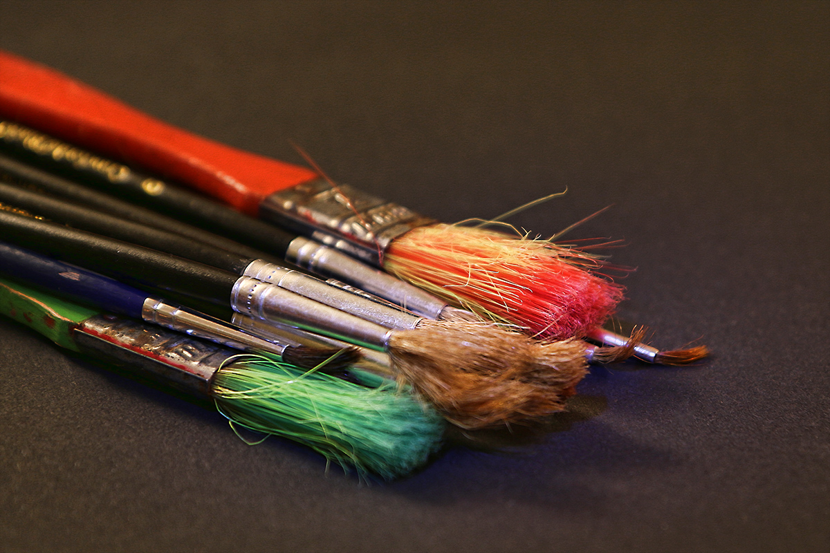
I gave your brushes entry a 6, although quite frankly, after looking deeper today I was a point generous I think. The material available had potential, and like you already noticed, the bristles should have been the focus. The blue shadow tones could have been addressed by a hue shift on that range. I agree with your NOT putting them flat as suggested by another commenter ... I like the added dimension as presented (flat would have been, well, too flat). :-) Curious - did you consider a B&W treatment? Another thought (hard to know without trying it) is more sidelight rather than angled top lighting? |
I can't remember for sure but I think I did give a B&W version a try and must have preferred the colour one. I recall I just used an everyday torch (possibly 2) for the lighting though not sure where the blue shadow came from (possibly the processing added this)
It was a really quick shoot just to enter something - if I had the time I would have liked to add paint to the brushes.
Thanks for the feedback - really appreciated. |





 Add photograph to your favorites
 Add photographer to your favorites


 Photographer found comment helpful.


