Critique Club critique
I'm a little late getting to this critique but here it goes.
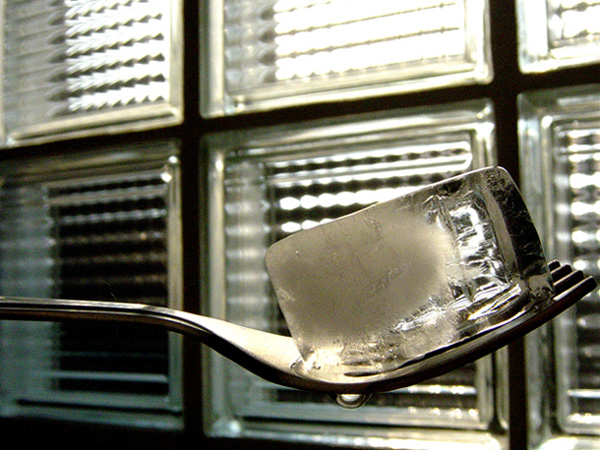
Somebody commented that the background and the foreground are competing visually with each other and I agree with this. I think it would have significantly helped to try to blur the background somewhat. This could have been achieved by moving the fork and ice cube farther away from the window and trying to position the camera even closer to the fork. You're right, the ice cube is not very square but it easily could have been. It should have been easy enough to create a perfectly square cube of ice either with a square container or by shaping it afterwards. I would have liked to see this abstracted more by really concentrating on the composition. As it is I feel that the overall design and composition are not very strong. I think it would have been more effective to see a strong design first and then to see that it is an ice cube on a fork, second. Maybe the ice cube could have been positioned to fit exactly in one of the squares in the window or maybe the fork could have crossed the image at an interesting angle. What if you had frozen the ice cube around the prongs of the fork so that it appeared like you picked up the ice cube with the fork? The image is very clean and sharp and the colors are good. You have plenty of squares in the scene so that it easily meets the challenge. The idea is an intersting one. I just feel that it needs to be stronger compositionally and conceptually.
T |





 Add photograph to your favorites
 Add photographer to your favorites


