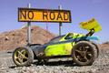
Taken outside in the Canyon Lake area. The road was closed which made for an easy picture taking opportunity. Adjusted the contrast as well as levels and slightly cropped it.
Statistics
Place: 75 out of 174 Avg (all users): 5.5421 Avg (commenters): 6.3158 Avg (participants): 5.5982 Avg (non-participants): 5.4615 Views since voting: 1008 Votes: 190 Comments: 20 Favorites: 0
As noted below, the main flaw in this picture is composition. The centrally located sign seems to lead to nothing interesting. The road being included, or the sign against the sky pointing to the ridge would have added to the quality of the photo.
Technical quality: Good clear capture, clear bright colors, beautiful shot of the sky. I personally don't mind the dings in the sign, makes it very realistic. no post-processing problems noted.
Meeting the challenge: Well done, the sign is the focal point.
Creativity: Well, this is not one of the most creative shots I have seen. I cannot really see any meaning of the sign in relation to the background although maybe the curve goes around that ridge and that is something we need to imagine when viewing the photo. Not really any kind of impact statement made with the shot that I like to see in a photo.
sign shows up nicely against the blue sky, but it makes my eye travel to the sky and way from the sky all the time. Would it have been possilbe to get higher and show some of the roadway and perhaps less sky?? The yellow pole show up nicely as does the dent in the sign and the black roughage on the sign.
Wow that is one dirty sign. I don't prefer centered shots, but in this case it works. You have placed it almost dead center of this shot and is pleasing to the eyes like that. I like the colors They are really vivid. Your focus was good, the sign is very crisp and so is the background, but it is not distracting. The lighting on the sign is good I guess the only thing that bothers me is how dark the foreground is and the shadowing. All in all great shot.7.
I think the composition of this shot would be improved dramatically if the sign were further on the left, so that the arrow was pointing into the frame. Awesome colors and capture of details.
Nice crisp colors. I don't think I would have placed the sign smack in the middle tho. However that arrow looks like it's pointing up that hill behind, the angle is the same. I like it.
It's a shame the sign is a bit dirty - it kind of distracted me. Beyond that I really like the composition and the colours - the blue sky and green shrubs really make the sign stand out nicely.
Could have been a great shot. As it is it just missses. The sign is too central, and I would have got lower so that the sign was fully against the sky & seperated from the background. Colours & exposure are great though, good work.
Loved the colours in this one. The only thing I could nag about is the dirt marks on the sign, slightly distracting, apart from that I really liked it :)






 Add photograph to your favorites
 Add photographer to your favorites

 Photographer found comment helpful.


