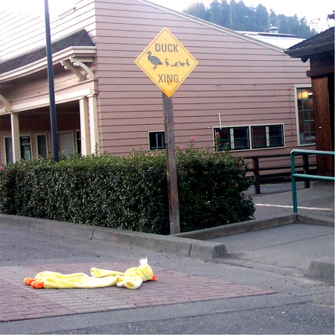
This photo has a strong 'cute' element to it. Your message comes across very well and the challenge is met :)
Photographically, the photo may be a bit weak. There are three specific elements here that I believe could use some improvement.
1 - The exposure is not as strong as it could be. It appears that you are shooting into the sun. This being the case, you have a little washout in the color on your sign and at the top of the building behind it. You did not post your camera settings so I can't make any suggestions on a different exposure route for you.
2 - Compositionally, your camera is tilted which causes the sign to be tilted in this photo. I'm not sure if that was intentional or not, but it doesn't really add anything to the photo.
3 - Your sign is dead centered in the frame. The surrounding buildingd don't really strengthen your photo, so maybe a tigter crop just including the 'duck' and the sign would improve the overall impact of this shot ....
The top of the photo is washed out til the sky is white and there appears to be a haze. Even the "sign" is washed out. As for the "duck" clearly in the crossing area, that's cute but not enough to make up for the washed out section.. Decent photo otherwise.
Funny idea, but the photo is IMHO not very nice. I think a closer cropping and using the rule of thirds (for the roadsign) would be helpful here. There is too much uninteresting on the right side of this shot. What about a faked skidmark ;-)?
This is a cute & creative idea, but there is not enough emphasis on the sign. The background is a bit distracting and there is a weird glare on the sign. Next time try not to put the sign right in the middle. By not centering the sign, you could have eliminated some of the background.
High marks for creativity. Two things... The sun is causing you a problem, which I know there's not much way around if you don't have more time; and, the shot really should be leveled. I'm giving a 6 for good effort and creativity.
You get points for humour although it looks like the photo needs to be rotated clockwise slightly (to make the sign and building point straight upwards). Focus and exposure are quite good - especially since it looks like the light levels weren't very good.
i think the deceased stuffed duck (or whatever it is) detracts a lot from the photo - makes it perhaps too 'campy'. also i think taking the photo from another angle would have helped as well as the building in the background doesn't do much for the photo while perhaps more of the street would have highlighted a little more the 'xing' aspect of the sign.





 Add photograph to your favorites
 Add photographer to your favorites

 Photographer found comment helpful.


