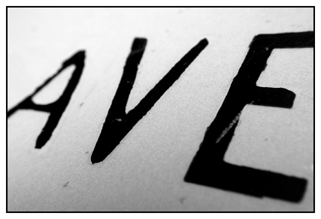
Very nicely done! Refreshingly different. The negative-space effect you gained from using black and white makes the letters appear knifed-out, like stencil. Sharp and sweet.
First of all, I think this photo should have scored better. It's tones and composition are very attractive to the eye. Your use of a shallow DOF only made this a 'classier' shot, and in my opinion works very nicely. The style of lettering on the sign is really cool and reminds me of David Carson's work.
Technically the photo is well done. the focus is good (understanding that you wanted a shallow dof). the lighting could have been a bit better. i'm not too crazy about the over-exposure happening on the top left.
Welcome back to the site, and hope to see more from you.
z
What a shame. This was one of my favorites of the challenge. Very simple, yet it grabs my attention. It clearly relates to road signs. I like abstracts a lot, and this one is very nice.
Do not be discouraged, mci. I've enjoyed your previous photos, and was surprised to see you back.
Wow, very very surprised this did not do better. This was one of my top 5 from the challenge. And dont get all pissy about the validity of the photo. The only measure of success that matters is your own. And, uhhh, mine. And I like it, and most of your other photos as well, so keep 'em comin, and screw the mindless masses!
hey, thanks to everyone who liked this. it was my first attempt at a challenge in several months and it scored way below my expectations. i guess i forgot how frustrating this community is as a whole.
apparently this photo has no validity, so i guess i can't complain.
This does not appear to be a road sign. It does not have good focus or lighting either. The background appears very dirty. Has no personal appeal or validity.
Tasty. This is the image that's sticking in my mind in this competition. Great approach to the challenge. One nit: since you don't have any pure white in the image, I'd avoid a white border. All black would look better.
Interesting perspective, but I'm afraid I don't care for it that much. I am missing the point of the narrow DOF, is the V more important than the vowels? The close of a view lacks any points of reference, are these typed letters (small) or 12" tall letters? The marks on the sign and lettering lead me to believe this "sign" has had a rough life. The lettering itself is on the rough side (slightly home-made feel). I get absolutely no emotional context, nothing to hold me to this shot. 5 Swash
I like this one a lot. Very "artsy" (forgive me for even using the term). I would frame this. Not necessarilt as a think piece, but more as a "Hmmm, interesting" piece. Good use of B/W and grain, as well as effective DOF. Good work.
Well done on submitting a macro shot to the challenge. The shallow depth of field works well (blurring both the A and E evenly). The border is ok and the photo actually has some interest to it - I keep looking at it. Good work.







 Add photograph to your favorites
 Add photographer to your favorites


 Photographer found comment helpful.


