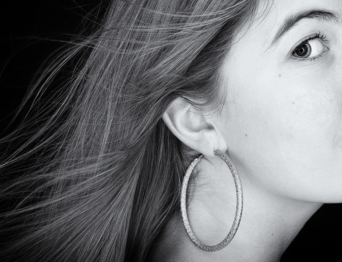
I think some creative text might have helped it look more like an ad. I appreciate the comments on the crop. I should have experimented more to see if a different crop would make it stronger.
Statistics
Place: 11 out of 35 Avg (all users): 6.1905 Avg (commenters): 7.2857 Avg (participants): 6.1667 Avg (non-participants): 6.1975 Views since voting: 726 Views during voting: 254 Votes: 105 Comments: 10 Favorites: 0
Nice. Excellent details and tones, and exciting composition. I'm wondering if you had something blowing her hair back, or is it gravity and it was rotated?
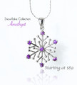
I'd have cropped the top to the middle of the eyebrow... or even crop it to the middle of her eye...and made the earring be the brightest spot in the image to draw attention to the jewelry you're trying to sell.
The little bit of shadows where I assume her mouth is starting are a bit distracting, but if you crop in the horizontal middle of her eye, you could take off some of the right of the image too and that would get rid of those mouth shadows. I'd also have cloned out the little bit of slit in her ear hole that makes me think the earring is going to be too heavy and cause slits in my ears.
I sound like I really don't like it, but that's not true. I DO love your idea here and it could be tweaked to be the winner of the challenge.
8





 Add photograph to your favorites
 Add photographer to your favorites

 Photographer found comment helpful.


