Author Thread Comments Made During the Challenge
Post actions
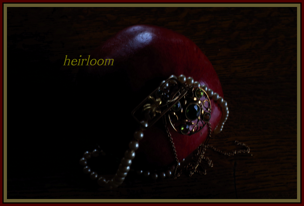
This seems a bit dark to me. I checked my monitor to view this on the brightest setting, but I still think that a bit more light would have helped this image a lot. Otherwise, I think this is a fine selection of jewelry, good focus, and nice image.
Post actions
Post actions
The color scheme is nice, and I like the low-key look, but there's a little motion blur in the photo you used.
Post actions
To me, this is too dark, although it might work if it had just been the pearls. Not sure what the red object is or why it is included.
Post actions
I don't like the border.
Post actions
Can barely tell what I'm looking at the image is so dark and underexposed.
Post actions
Post actions
The border/s do this in, in my view.
Post actions
Post actions
coming in a bit dark on my screen but nice idea







 Add photograph to your favorites
 Add photographer to your favorites


 Photographer found comment helpful.


