Not crazy about the different color texts, but that's ok -- this is a photography site, not a design site. The photography is marvelous on this one! Voted earlier, coming back to comment. :)
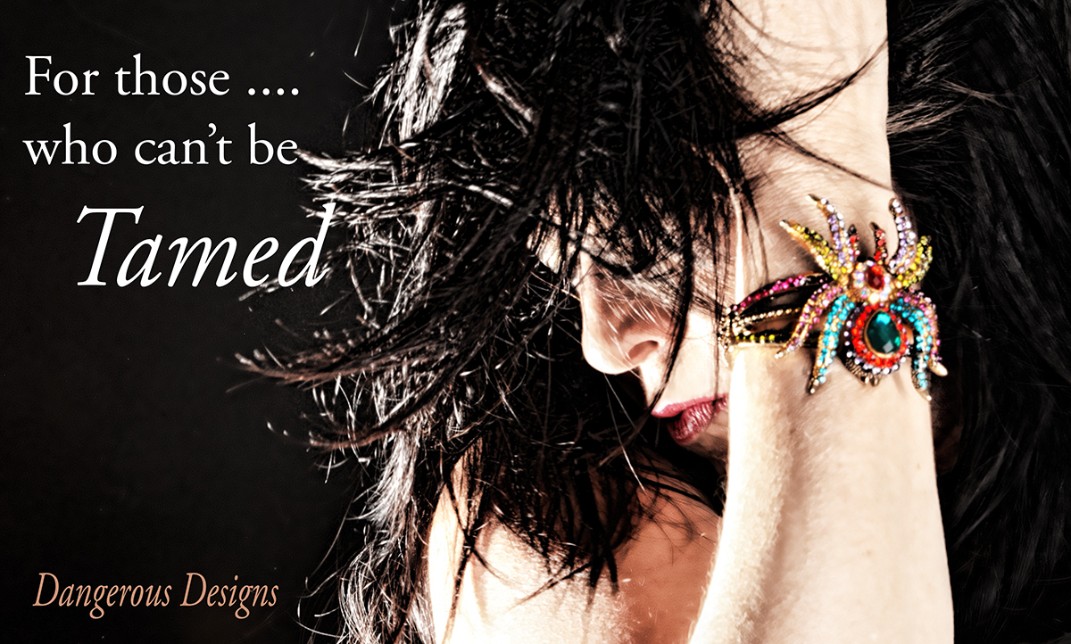
I like how well the theme (dangerous, can't be tamed) is relfected in the photography. Some may want the bracelet more focused, but I think it's fine as is - works well with the whole ad this way.
This is a fantastic idea. The image is perfect and the text ties it all together. The only issue is that the product you are trying to sell is out of focus.
I wish the jewelry were just a bit more in focus to really make me be able to see it and want to buy it. It doesn't have to be sharply in focus... but a bit more, in my opinion.
This is an excellent concept. I wanted to give it a high rating, but I think if this is about advertising jewelry, the bracelet should have been more in focus with maybe the wearer in softer focus.





 Add photograph to your favorites
 Add photographer to your favorites


 Photographer found comment helpful.


