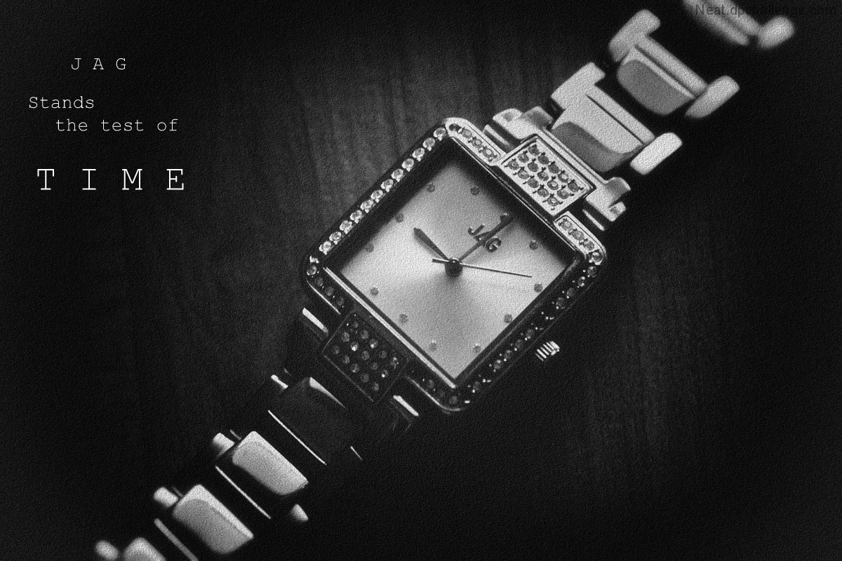
I enjoyed this one, Anita. The grain seemed to bother several of the commenters, but I thought it added to the vintage mood. The font choice split the commenters, but I found it fit well. It probably would not have occurred to me to try grain for a fine jewelery ad nor use a font like courier, but I think those two choice made me appreciated this one more because you made it work and helped illustrate how I should expand my choices and experiment more.
Thanks Mark for your insightful comment, you know I don't post photo's on DPC to please the masses, I just do my own thing, if people get it good, if they don't well.....
I enjoyed this one, Anita. The grain seemed to bother several of the commenters, but I thought it added to the vintage mood. The font choice split the commenters, but I found it fit well. It probably would not have occurred to me to try grain for a fine jewelery ad nor use a font like courier, but I think those two choice made me appreciated this one more because you made it work and helped illustrate how I should expand my choices and experiment more.
Going to guess you used some sort of film simulation to get the texture in the image. Unfortunately it does not work for me and looks more like noise then some old film.
I like your composition and the message. I wish the jewelry stood out more. I think the noise is making it recede into the background instead of popping out and making me want to buy it. 7






 Add photograph to your favorites
 Add photographer to your favorites


 Photographer found comment helpful.


