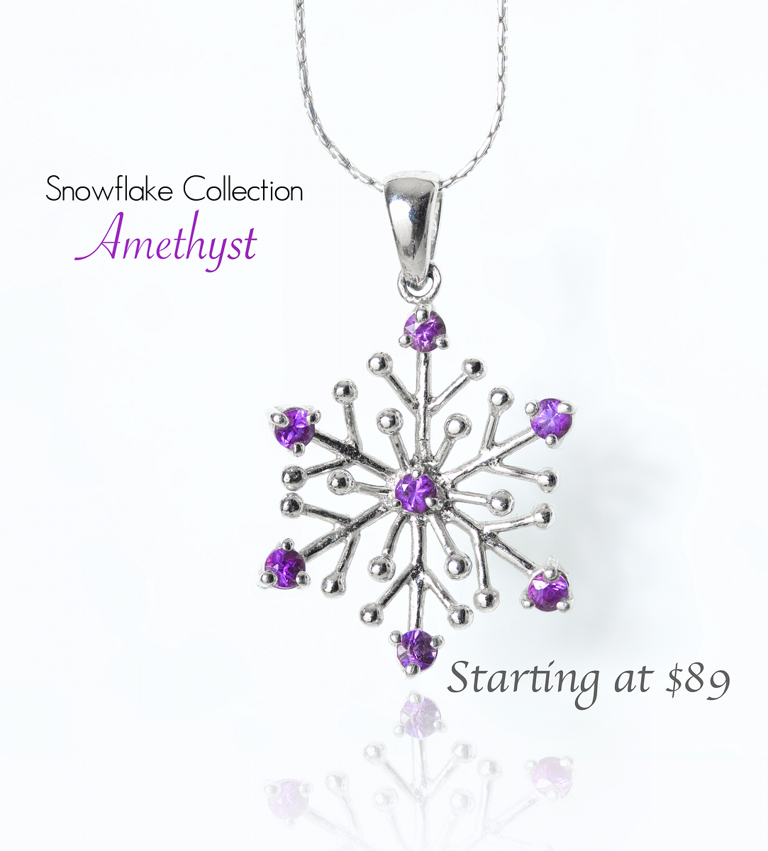
My favorite technique, focus stacking, is employed here to ensure I get detail through. Just three images needed, for such a flat object. But it really makes a difference. That way, I don't have to chose which gems are in focus, they all are.
After that, I took it into PIxelmator, where I added the reflection and text. Text was a big deal for me here, I wanted this to be as much like an ad as possible. I went with:
Top left text - Black, whit a very elegant looking font. Something that really says "collection"
Amethyst text - Amethyst color (at least somewhat) with a cursive font. Amethyst says classic style to me, and I wanted the font to match that
Lower right text - I didn't want this to be featured, but still available. So the font is a little less elegant, and the color is dark grey. Bolded.
I really like the way this turned out. So does my wife. Not just because it's one of her favorite pieces, but she commented on the fonts and reflections as being very classy and pretty.
Shooting for a top 10 here :)
Statistics
Place: 10 out of 35 Avg (all users): 6.2212 Avg (commenters): 7.6000 Avg (participants): 5.9167 Avg (non-participants): 6.3125 Views since voting: 808 Views during voting: 242 Votes: 104 Comments: 6 Favorites: 0






 Add photograph to your favorites
 Add photographer to your favorites


 Photographer found comment helpful.


