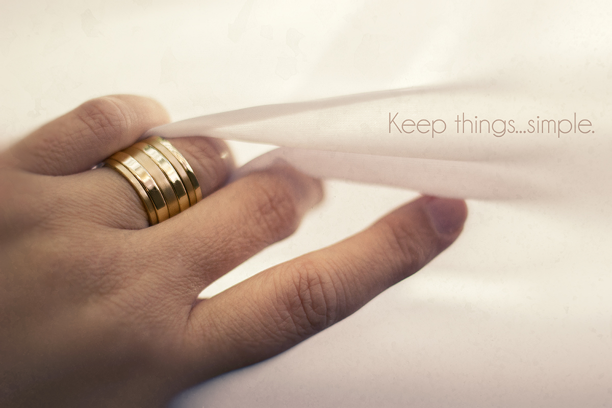
Really nicely edited. A little front focused though, with the knuckles more in focus than the far end of the ring. 8 for the edit. -1 for the focus issue.
I totally love the focus being so much on the jewelry (something so many did not do in this challenge) and that you've kept things simple...
I also like the composition. But... on my monitor, there are splotchy areas in the upper third and in the other white areas.
I think a professional advertisement would have smoothed the skin a bit... especially the pointer finger knuckle which competes with the ring a bit in the focal range.
Where the middle finger meets the fabric is an odd blob on my monitor.
I know it sounds like I hate this image... LOL! But, actually, it's one of my favorites so far.





 Add photograph to your favorites
 Add photographer to your favorites


 Photographer found comment helpful.


