Was shot on a slight angle (which is fine) but you cropped it square and tried to make it look centered. It is off just enough to be noticeable but not enough to make it look good/ok. A rectangular crop with space for wording would have worked much better.
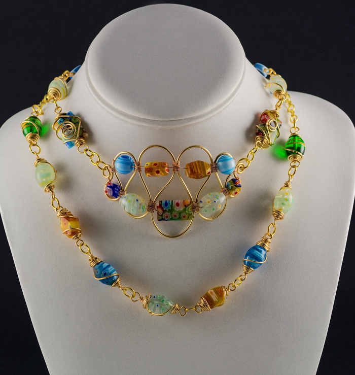
Lovely composition and colors! The lighting does not highlight the jewelry enough, in my opinion, to be a professional advertisement for jewelry. I'd like to see the jewelry steal the show in the image by making me not be able to look anywhere else in the image for long.
As it is, the brightest spots of the image are the white display. Make that jewelry POP out at me so much that I can't ignore it!
7
Gorgeous light!!! It perfectly highlights the delicate work and vibrant colors of the blown glass beads. Just a slight tilt down to the left to mar perfection
Really nice job, but I find the shadows distracting. I think more even lighting and an overall brighter image would make the jewelry really pop on that white background.





 Add photograph to your favorites
 Add photographer to your favorites


 Photographer found comment helpful.


