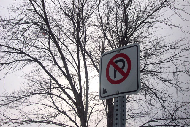
I was really at a loss for this week's submission.. I didn't find one thing really all that great. This image looked so much better with my eyes, but through the camera, it loses something..
Statistics
Place: 142 out of 174 Avg (all users): 4.6919 Avg (commenters): 5.6667 Avg (participants): 4.6339 Avg (non-participants): 4.7674 Views since voting: 1043 Votes: 198 Comments: 11 Favorites: 0
Does the subject grab attention? I believe it does to a certain degree.
Is sharpness important?
Sharpness is very important in a shot of this type.
Exposure:
Here is where we start. A shot like this is difficult due to the amount of light in the background to the amount in the foreground. I am not sure if your camera has the ability to take diff readings of light at the same time or if it has an exposure lock, but that is what is needed here to allow for formal consideration. (possibilities)
The exposrue is somewhat lacking but I do believe it is becuase the amount of light in the background and lack of in the foreground.
Colors:
On your shot you want your focal point to speak out and color is a good way to do that. The sign has a nice red circle around it. This red would be better sparked with light known as fill. (Weak flash to off set hard shadows.
Lighting:
I went into lighting in colors but here goes an elaboration. You do need a fill here and that wouold be a very important thing. That would set off your focal point and make it way more appealing. I think others have commented on that in a round about way and I will agree. You do not want your lighing ratio to be very high on a shot like this, especially if you have to read something that is being backlit. Another thing you could have done was used a white piece of poster board to reflect the sun back into the sign. That would do well in this case causing a ratio of 2 parts light from the back to one part light on the sign. White reflectors can be a wonderful tool to fill in shadows. Try it you will like it.
Composition:
It appears that the sign is tilted back. That can be a tad bit anoying. I think the sign would do better a little higher in the photograph. That would maybe give a little better direction to the photo. The eyes tend to get lost in the light of the sky.
Conclusion:
What you have here is not something that I would hang on my wall, but who would hang streetsigns on their wall. With a bit of fill and some composition changes you can have a 5.5 to 6 photo here. I am not sure if you consider that good, but I would considering what you had to work with here. I would like to see the shot retaken with some of the ideas listed above.
You might have been better to put the bright spot in the sky directly behind the sign. As it is, the sign is just something in the way of an interesting tree silhouette.
I know it is a sign contest but I can't help commenting on the great tree and beautiful sky. A great package. Just one thing (which didn't affect my vote) what is in the tree on the left hand side?





 Add photograph to your favorites
 Add photographer to your favorites

 Photographer found comment helpful.


