I don't like your font... it needs to be able to be quickly read as I pass by your billboard or flip through my magazine to get to another article. It needs to grab me, not make me struggle to read it.
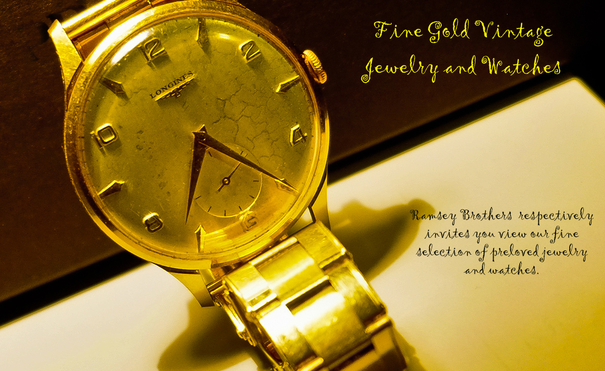
Also, the bright yellows in the watch band and the blown spots compete for my attention (and win) against the face of the watch.
I do like your composition, although I would not have cropped it so close on the upper edge of the face of the watch.
I wish the face of the watch were the brightest spot in the whole image... so my attention would go there immediately and want to stay there... and buy your jewelry. :D
I love the angle of the watch at a tilt to make the advertisement not so rigid. Good choice. 6 |





 Add photograph to your favorites
 Add photographer to your favorites


