So I did a lot of research on this one, and experimented with various things. I didn't want to do a normal jewelry shot, so I figured that Harry Winston, De Beers, etc, would have some really cool, funky jewelry shots.
They really didn't!! They were pretty much your straight forward jewelry shots.
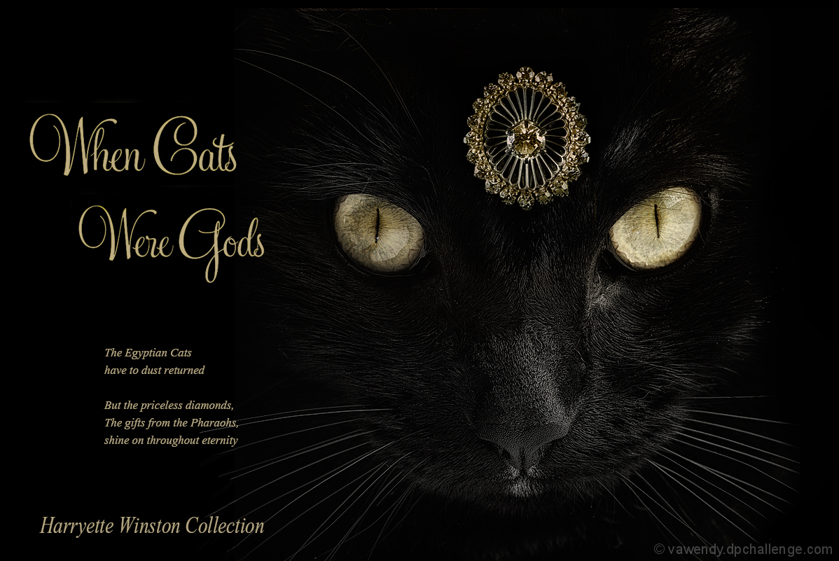
But then I came across a 1940s Harry Winston shot that made me want to recreate it, in color.
The jewelry is my mother's ring (thought I made it into yellow diamonds for the add, so that it went with the eyes.) The center stone is from her engagement ring. A couple of the outside diamonds are from her wedding ring, and it was given to her by my father. It's incredibly special to me.
There were a couple of comments that it should have been brighter. It was brighter in the beginning, but it seemed to stick out too much. I wanted it to look realistically placed. I don't know that I succeeded, but brighter made it look like it wasn't really a part of the picture.
The text is too large. I should have shrunk it down quite a bit.
I did this on Tuesday, thinking it was due Tuesday night. Once I realized that it was due thursday, I borrowed my neighbor and tried some other shots. I played around with flash and letting in more ambient light and lighting the earrings with an LED flashlight. It was fun to experiment. I liked these, but I thought the cat was different.
I actually found a Harry Winston add with a seagull! I thought about that, but didn't think it would go over well here. :)
Yes agree you were rambling on a bit but i like your image and lighting from the out takes your neighbor models well ..hope she wont be pissed off you went with the cat version :)
Really love this edit. I wish that the jewelry was centered between the eyes, and perhaps the text raised a bit. Really striking, but not as well assembled as it could have been.
The photography is excellent - amazing detail on the cat's face and eyes, which is tough on a black cat! Not thrilled with the words. For me, the picture alone would have been even better.
Great idea, and beautiful cat, but I feel that the jewel competes for attention with the cat's eyes. For me the jewelry could be sharper and have more sparkle. In my top 5.
The text adds too much, in my opinion. If the advertisement were just that wonderful shot of the cat and the jewel (maybe with more sparkle on the jewelry so it doesn't compete so much with the eyes for attention) and then... after you'd totally captivated me... I'd go down to read the tiny text about what you're selling.
As it is, the text so overwhelm me and the eyes are so in focus, that I barely get to the jewelry itself.
Still... going on photography alone, this is among my top few.
8 as shown. 9 without the text. 10 if the jewelry were the sharpest part of the image.
Nicely done. I love the lighting on the cat, but I would like to see the jewelry much brighter. It has too much competition for attention with the eyes.







 The Harryette Winston Collection
 Add photograph to your favorites
 Add photographer to your favorites


 Photographer found comment helpful.


